10
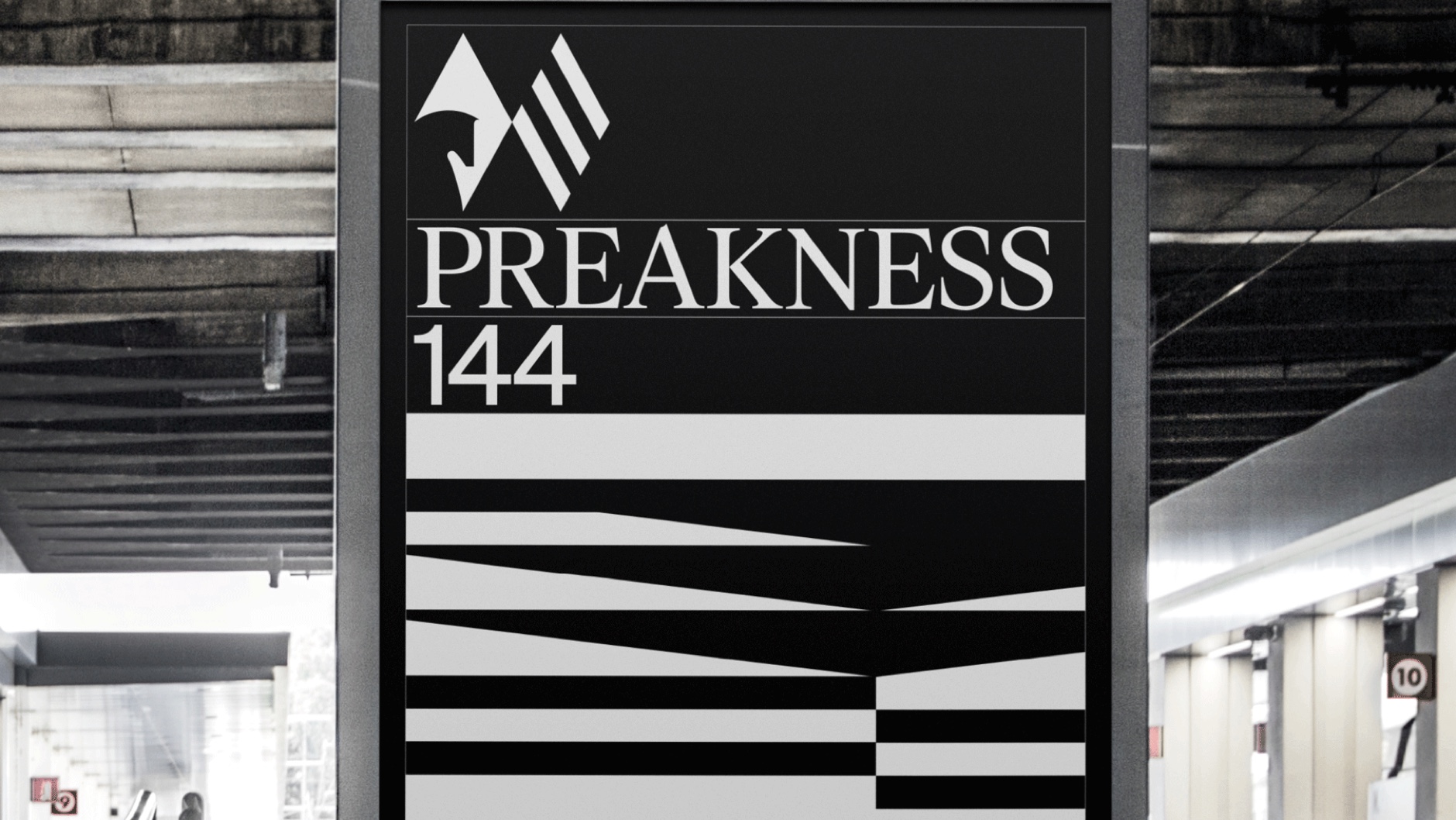
Preakness 144
Role ↴
Design Director
Role ↴
Design Director


P
Process ↴


Every year Baltimore (MD) prepares its racetrack, Pimlico, to host the Second Jewel of the Triple Crown: Preakness, an emblematic race full of history and symbology. The Triple Crown of Thoroughbred Racing, commonly known as the Triple Crown, is a title awarded to a three-year-old Thoroughbred horse who wins the Kentucky Derby, Preakness Stakes, and Belmont Stakes. This triple victory is a very unusual result where few horses made it to the winner spot. For that reason, the odds of having one horse going to the final are very rare. Moreover, Preakness, being the middle race, is the tipping point of the Triple Crown. Hence its name: The Second Jewel of the Triple Crown.
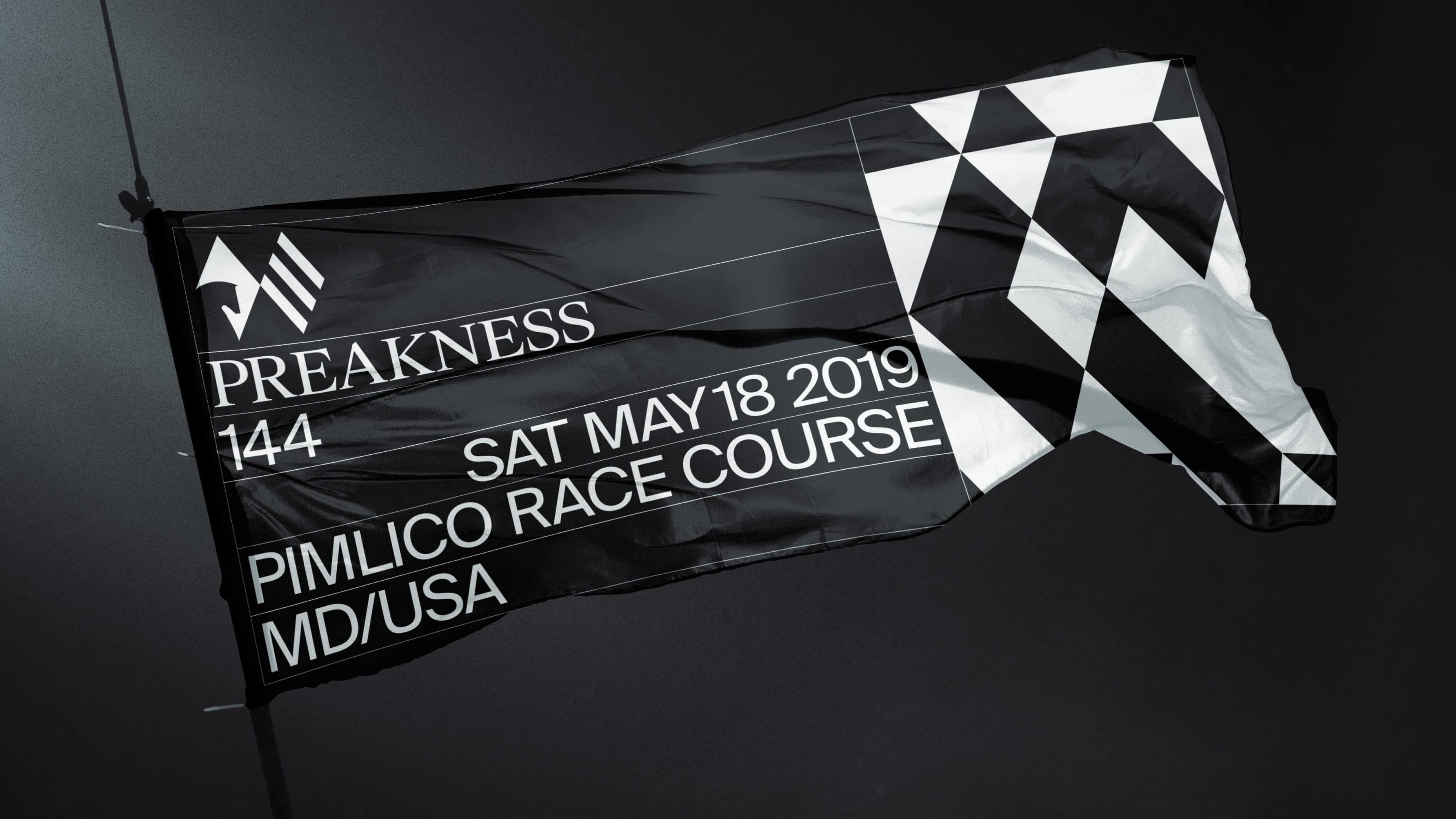
On top of its history and symbology, Preakness has an extensive archive (144 years) of posters and identities they launch every year. With the new 1/ST rebrand, they asked us to create the last and definitive brand for the 2019 one (Preakness 144): an identity full of meaning and heritage that could last forever.
So we kept the name and the variable of the year number to respect its heritage but created a new icon that could stay forever and could speak for the magic of the race: the Second Jewel. Lastly, we needed to integrate all these ideas within the 1/ST brand framework and language where patterns, scribbles, and an in-depth library of assets come together.
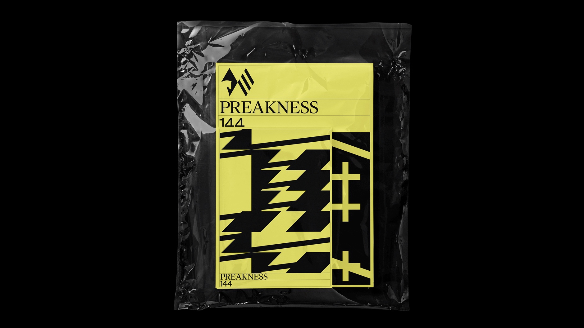
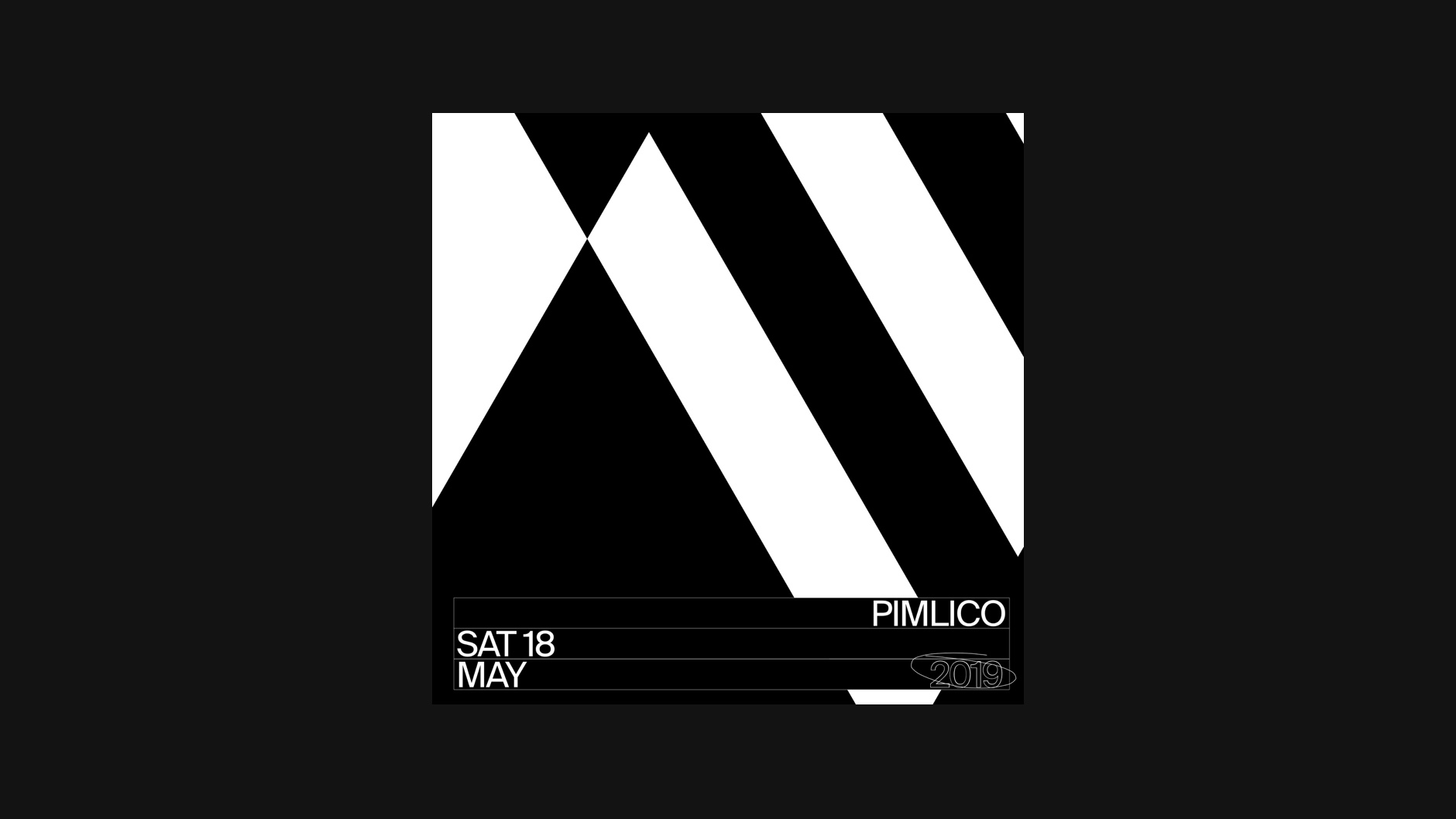
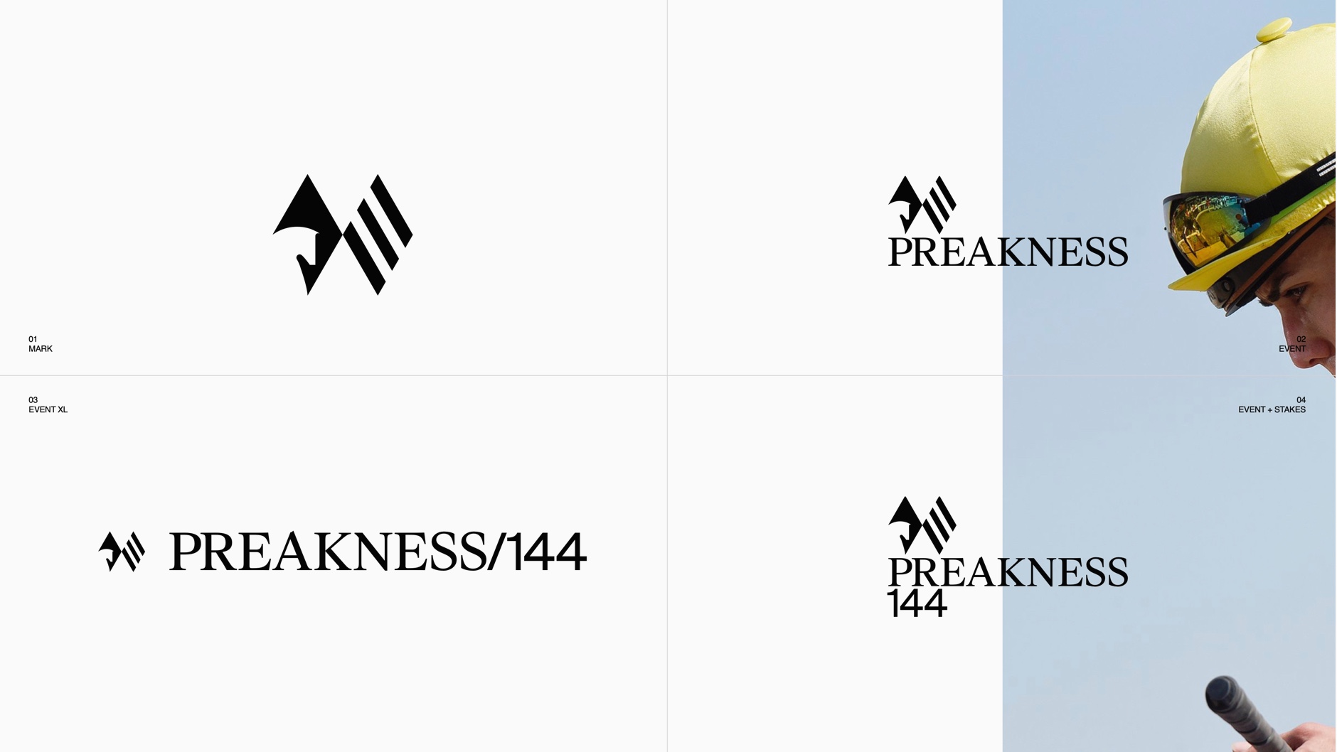
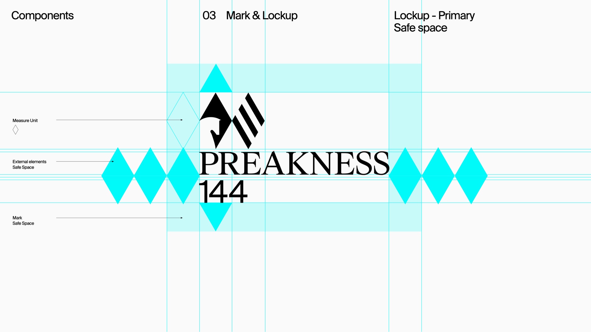
The two diamonds
The mark consists of two diamonds (the second jewel) unified. The first diamond contains the horse, the new center, and focus, of the 1/ST brand. The horse head is the same head we developed for Pegasus identity (developed the year before for the other 1/ST emblematic race, hosted in Gulfstream Park, Miami). The second diamond is made of 3 bars that represent the Triple Crown. The first diamond with the horse head is always moving forward, towards the second diamond, the Triple Crown.
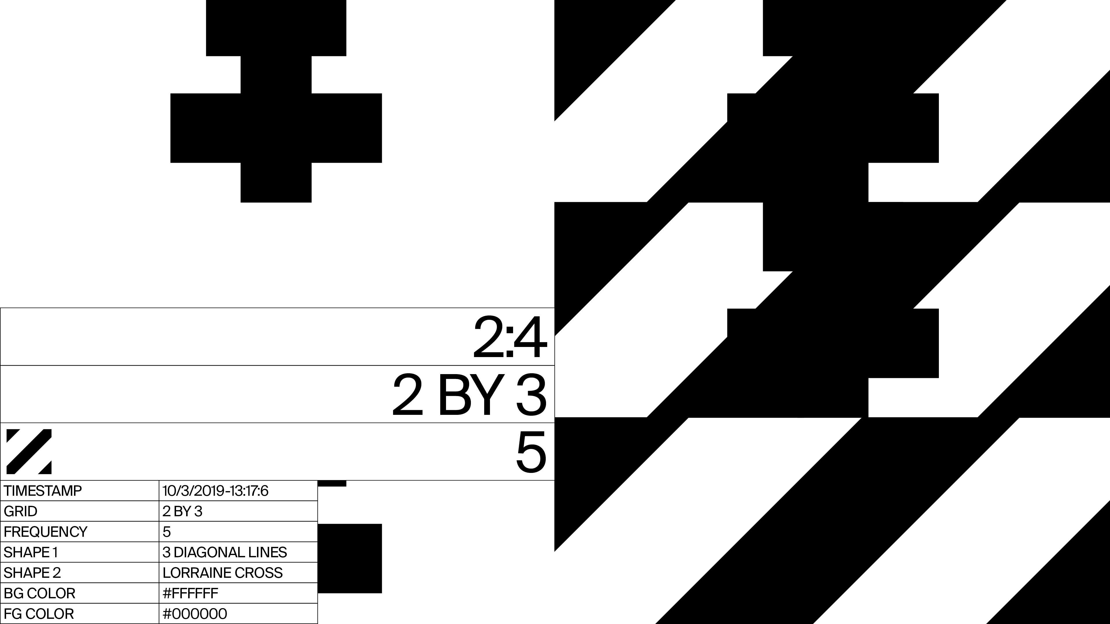
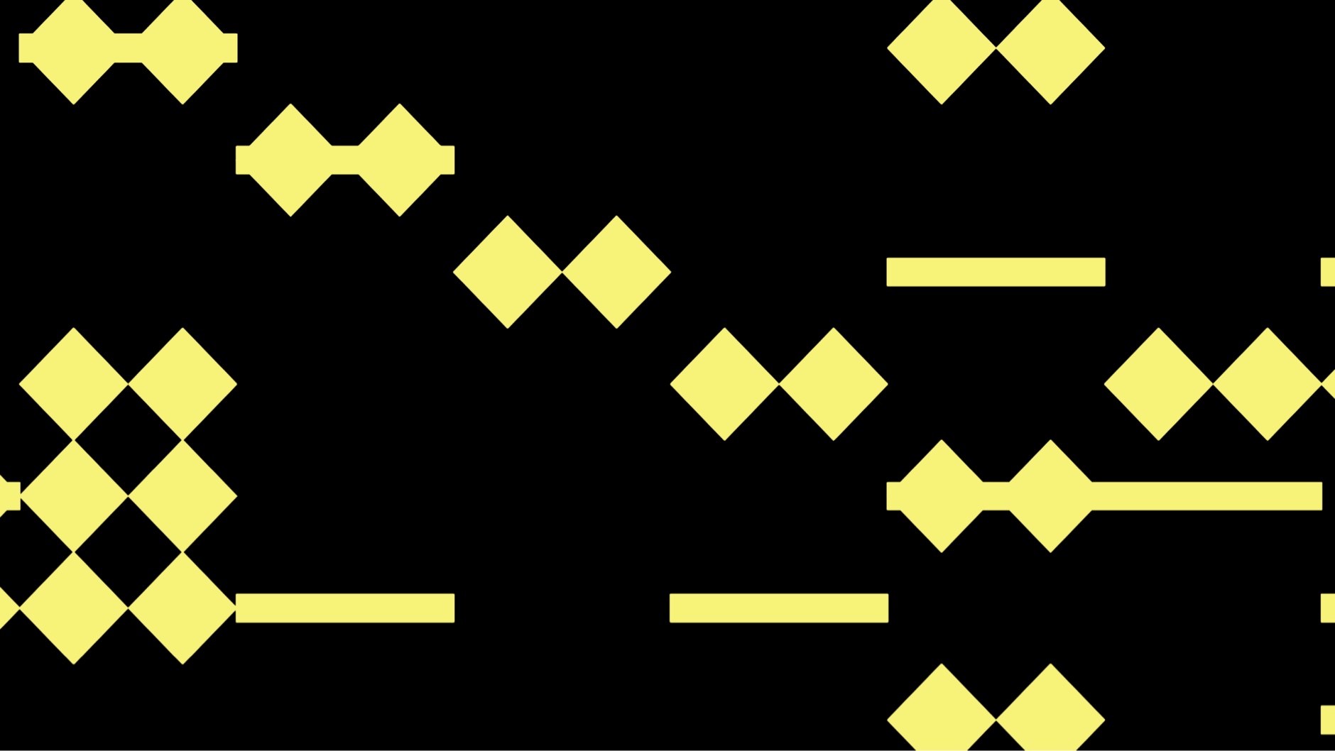
The 144 grid
From the two diamonds shape, we built the 144 grid. A 2.0 version of our generative pattern tool developed internally, where a new set of patterns was created only for Preakness.
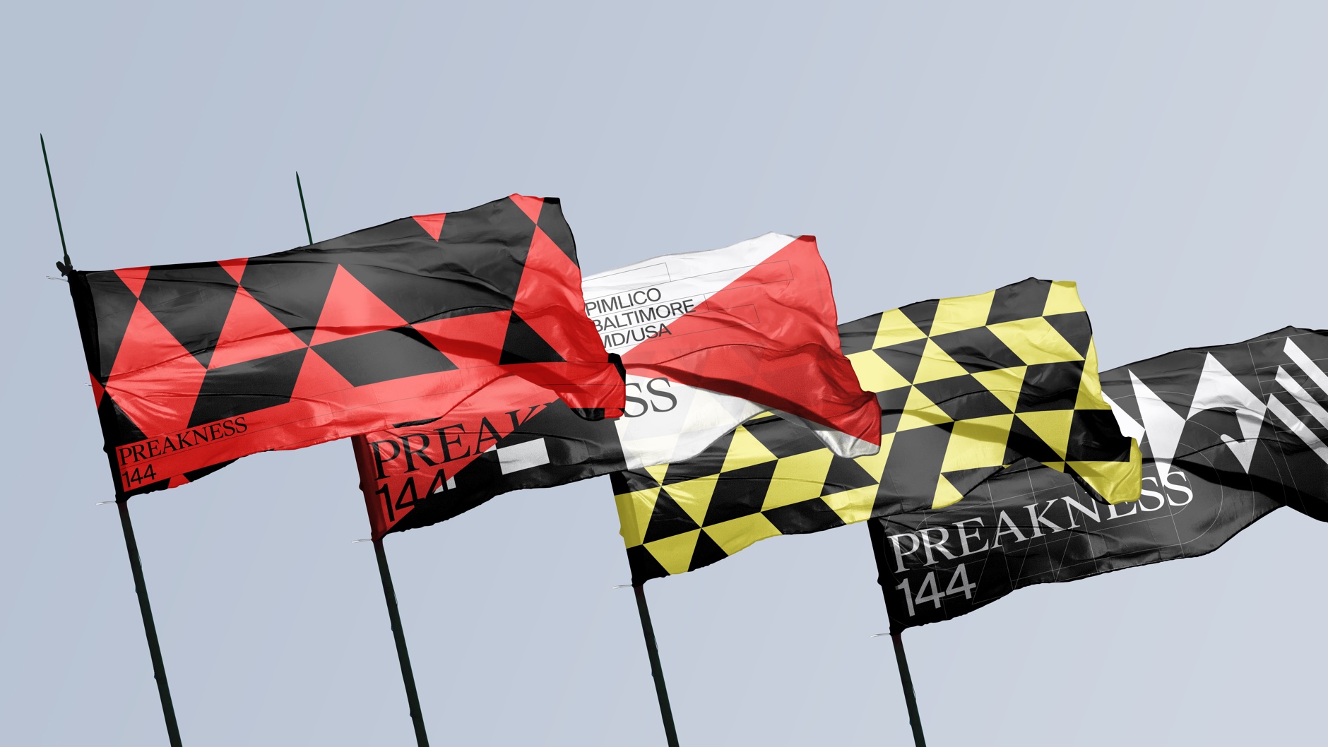
Maryland
The last ingredient to figure out was the color palette. Maryland was the answer. The flag of the state of Maryland is used and known across the state and any cultural events.
With this trifecta, we put together the Preakness brand ecosystem together and developed a toolkit for internal teams to develop and produce any asset needed: from signage, environmental design, communications, editorial, and video pieces to dotcom.
The mark consists of two diamonds (the second jewel) unified. The first diamond contains the horse, the new center, and focus, of the 1/ST brand. The horse head is the same head we developed for Pegasus identity (developed the year before for the other 1/ST emblematic race, hosted in Gulfstream Park, Miami). The second diamond is made of 3 bars that represent the Triple Crown. The first diamond with the horse head is always moving forward, towards the second diamond, the Triple Crown.
The 144 grid
From the two diamonds shape, we built the 144 grid. A 2.0 version of our generative pattern tool developed internally, where a new set of patterns was created only for Preakness.
Maryland
The last ingredient to figure out was the color palette. Maryland was the answer. The flag of the state of Maryland is used and known across the state and any cultural events.
With this trifecta, we put together the Preakness brand ecosystem together and developed a toolkit for internal teams to develop and produce any asset needed: from signage, environmental design, communications, editorial, and video pieces to dotcom.
Character NY ↴
New York, 2019
Team ↴
Virgilio Santos (Creative Director)
Manuel Dilone (Creative Director)
Cris Mascort (Design Director)
Jon Marsh (Senior Designer)
Jun Ki Hong (Designer)
Teri Kaplan (Project Manager)
Johnny Lee (Motion - Case Study)
Foundry ↴
Suisse Typefaces for Suisse International
New York, 2019
Team ↴
Virgilio Santos (Creative Director)
Manuel Dilone (Creative Director)
Cris Mascort (Design Director)
Jon Marsh (Senior Designer)
Jun Ki Hong (Designer)
Teri Kaplan (Project Manager)
Johnny Lee (Motion - Case Study)
Foundry ↴
Suisse Typefaces for Suisse International