12
MUTHA
Role ↴
Design Director
Role ↴
Design Director
Brand Identity
Art Direction
Packaging Design
Interactive Design
Brand Program for a new beauty product created by Hope Smith. A new product that contributes redefining what motherhood means today.
Art Direction
Packaging Design
Interactive Design
Brand Program for a new beauty product created by Hope Smith. A new product that contributes redefining what motherhood means today.


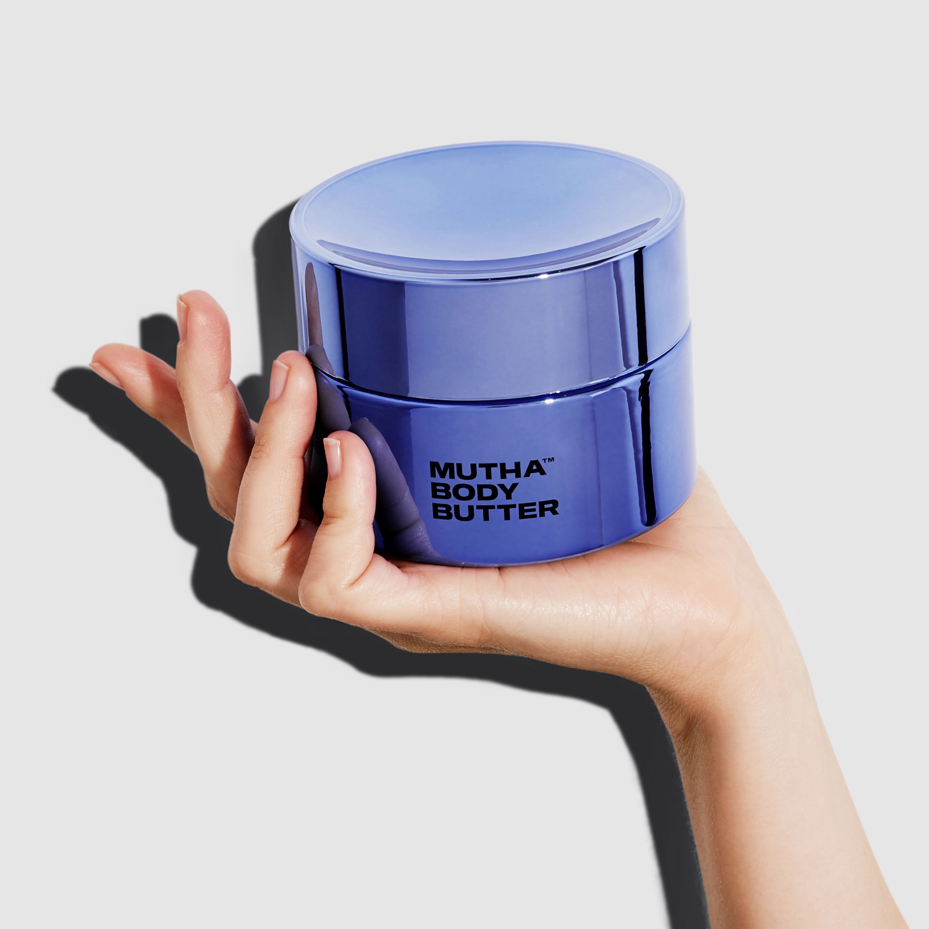
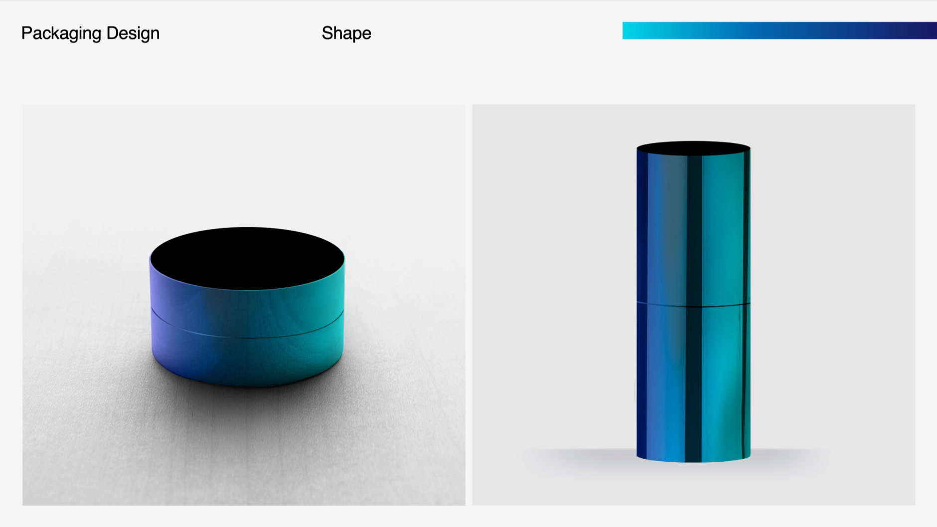
Due to production urgencies, we had to follow an unusual process: we started unpacking "bravery" as our design strategy, not through a logotype but from the packaging. We started researching materials and colors at first but also thinking about how we could give a more thoughtful and considered approach around the experience that comes with it. Understanding the daily routines of busy mums today, we wanted to be sure the packaging was supporting that by creating a tool rather than an accessory. We gave to the primary packaging of the body butter a second life by designing a concave lid that serves as a ring plate, so women can store their rings when applying the cream.


P
Process ↴


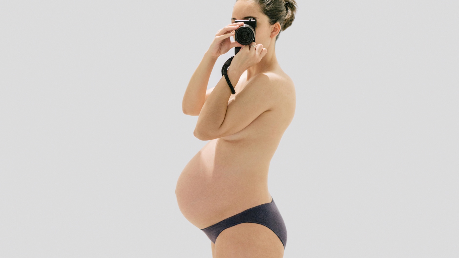
When founder Hope Smith got pregnant found herself underwhelmed by the skincare products that were blending within the category and not talking to the Mothers of today. She introduced a skincare brand that gives women the same level of care that they give to their families no matter who they are: their children, partners, or friends.
MUTHA is a brand that would embody Hope's ambition and carve out an unforgettable place in our crowded bathroom vanities. So we looked at motherhood for what it is — an ever-evolving cycle.
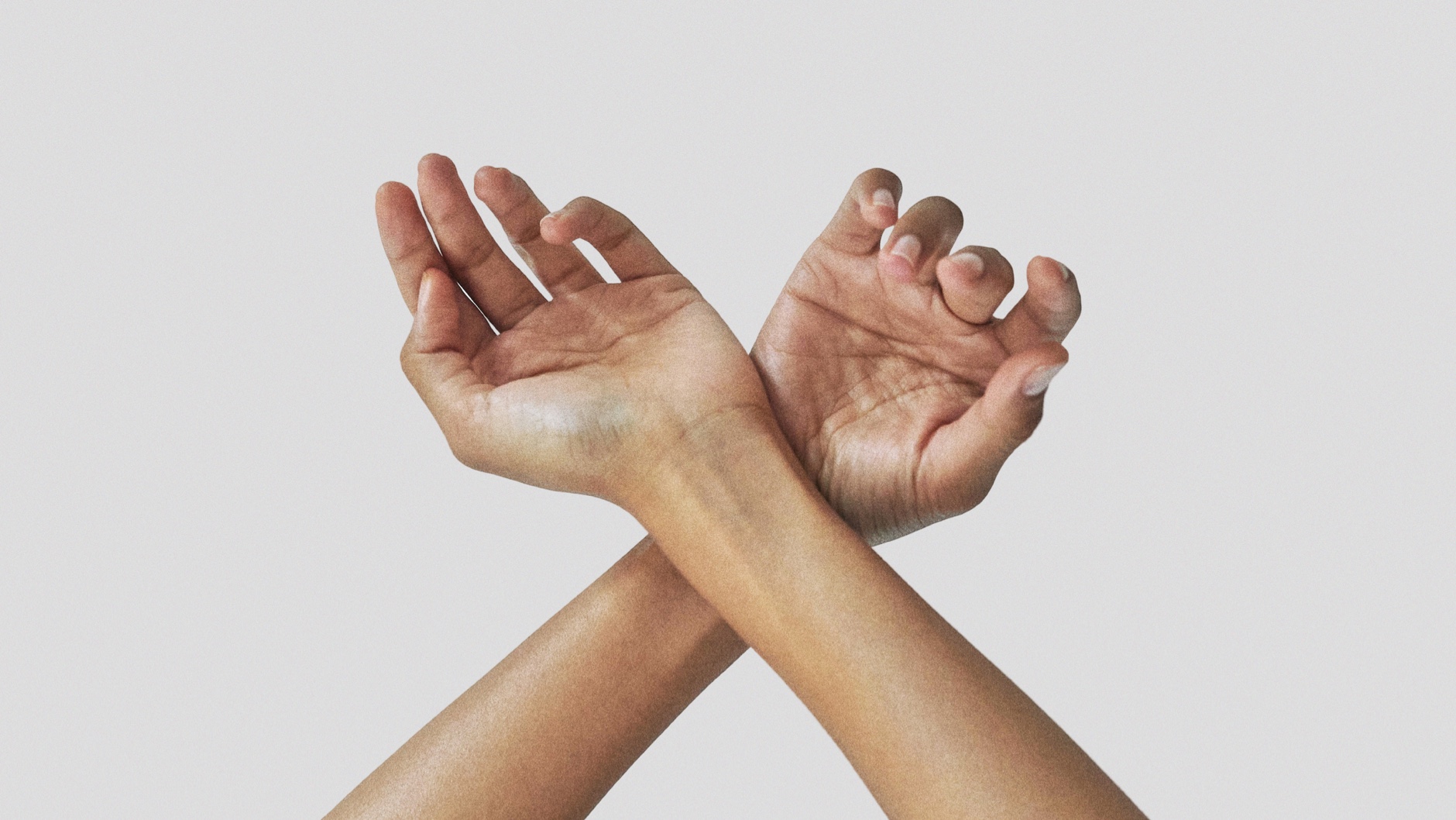
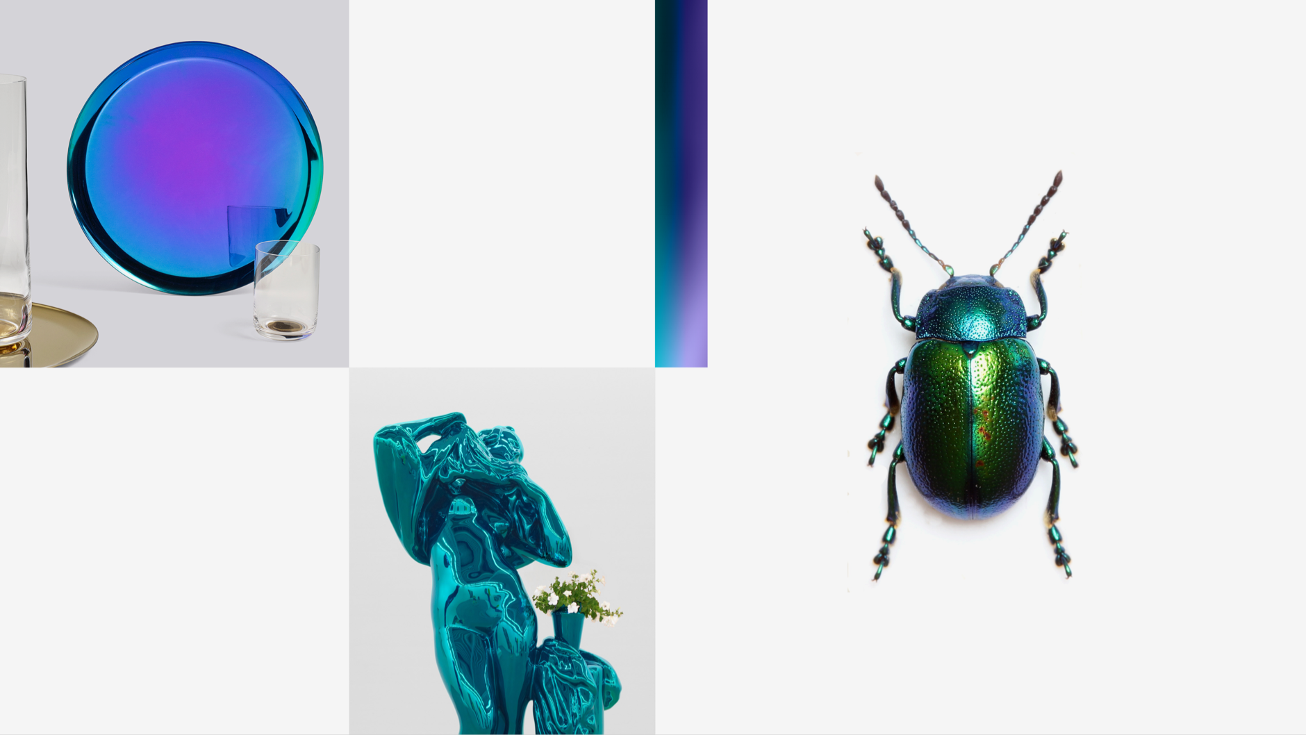
There are an innate strength and bravery that radiates from every mother. To reveal and celebrate this self-sufficient power, we scoured the world for things both bold and organic. We landed upon the boldest and organic armor found in nature: one that displays the inner force of each mother with vibrance and pride (like the iridescent shell of a beetle or the bold color of the color of strawberry poison darts in Costa Rica).
MUTHA is a brand that would embody Hope's ambition and carve out an unforgettable place in our crowded bathroom vanities. So we looked at motherhood for what it is — an ever-evolving cycle.
There are an innate strength and bravery that radiates from every mother. To reveal and celebrate this self-sufficient power, we scoured the world for things both bold and organic. We landed upon the boldest and organic armor found in nature: one that displays the inner force of each mother with vibrance and pride (like the iridescent shell of a beetle or the bold color of the color of strawberry poison darts in Costa Rica).
Due to production urgencies, we had to follow an unusual process: we started unpacking "bravery" as our design strategy, not through a logotype but from the packaging. We started researching materials and colors at first but also thinking about how we could give a more thoughtful and considered approach around the experience that comes with it. Understanding the daily routines of busy mums today, we wanted to be sure the packaging was supporting that by creating a tool rather than an accessory. We gave to the primary packaging of the body butter a second life by designing a concave lid that serves as a ring plate, so women can store their rings when applying the cream.
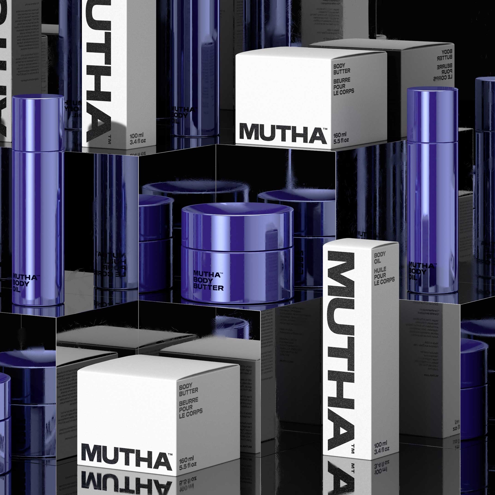
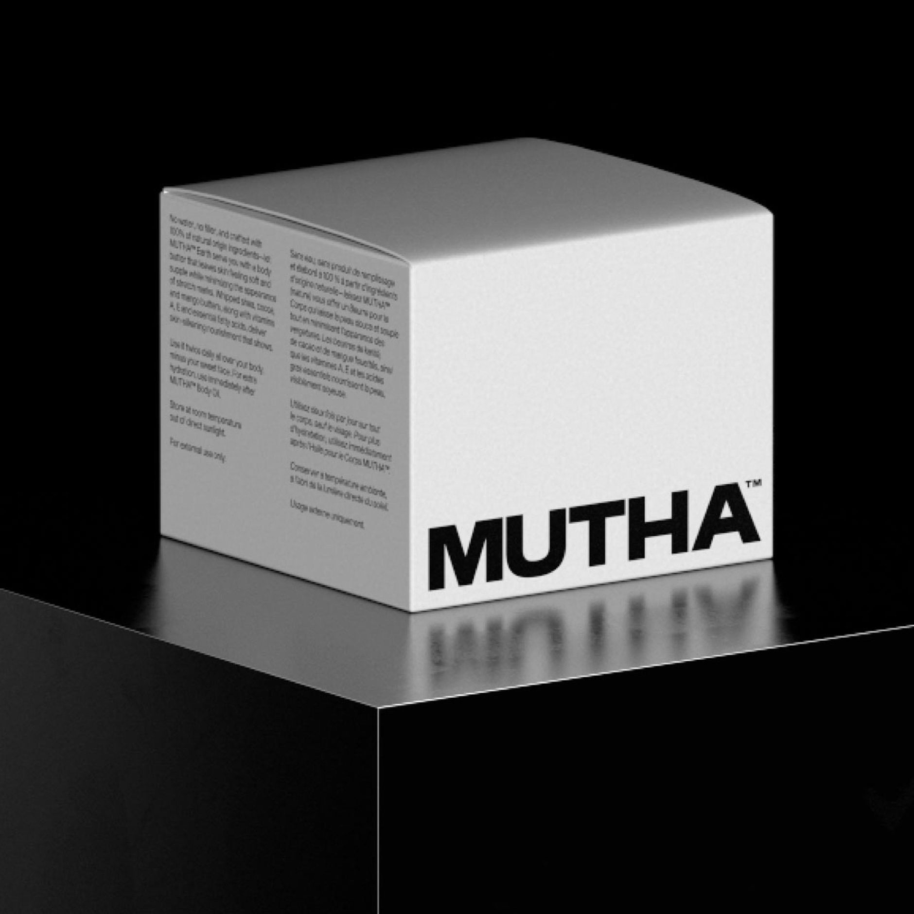
As part of the full brand program, we also developed the brand strategy, we named it and created the tone of voice. We also designed the full brand system: from logotype, art direction, and launch photoshoot, secondary packaging, e-commerce site, out of home, and a handful number of other applications.
As part of the full brand program, we also developed the brand strategy, we named it and created the tone of voice. We also designed the full brand system: from logotype, art direction, and launch photoshoot, secondary packaging, e-commerce site, out of home, and a handful number of other applications.
Character NY ↴
New York, 2019
Team ↴
Virgilio Santos (Creative Director)
Manuel Dilone (Creative Director)
Alessandra Lariu (Strategy Director)
Cris Mascort (Design Director)
Gabby Lord (Sr Designer)
Pedro Veneziano (3D Designer)
Brooke Amber (Namer/Copywritter)
Marlena Ryan (Sr Copywritter)
Teri Kaplan (Project Manager)
Samuel Pasquier (Photographer)
Joe Wright (Photographer)
Alis Atwell (Set Designer)
Fitkive Kin (Website Development)
Foundry ↴
OGJ type design for Sequel Sans, Sequel 100 Extended
Featured in ↴
The Brand Identity
Under Consideration (BN)
+
Violet Grey
Vogue
Flaunt Magazine