06
Godiva
Role ↴
Design Director
Role ↴
Design Director
Pitch
Brand strategy and brand design for the iconic Belgium chocolate company.
Brand strategy and brand design for the iconic Belgium chocolate company.


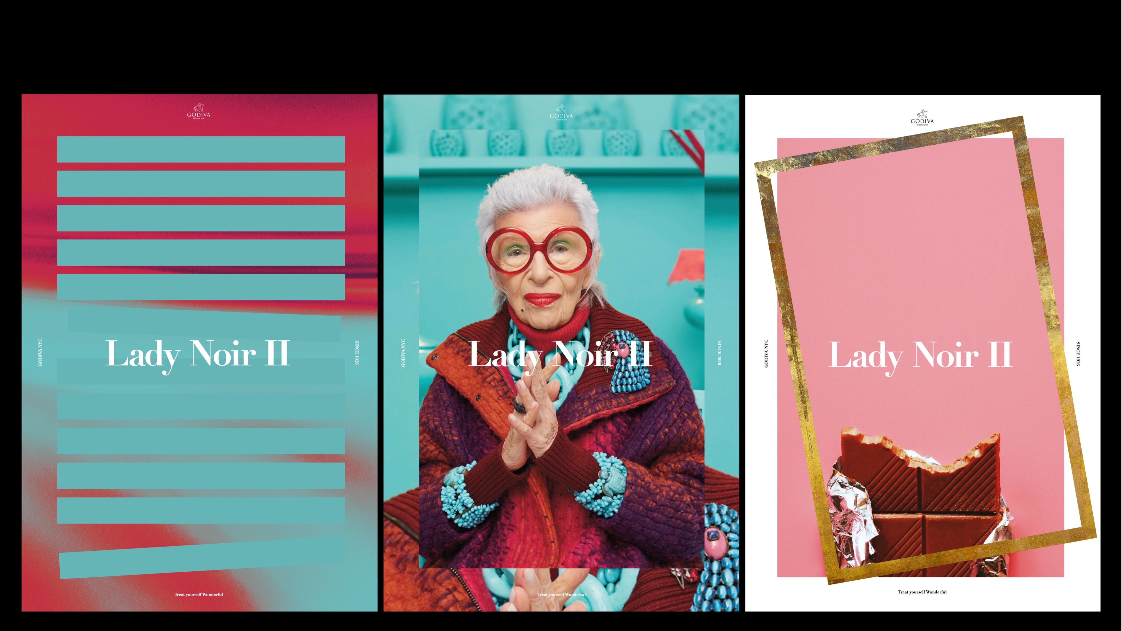
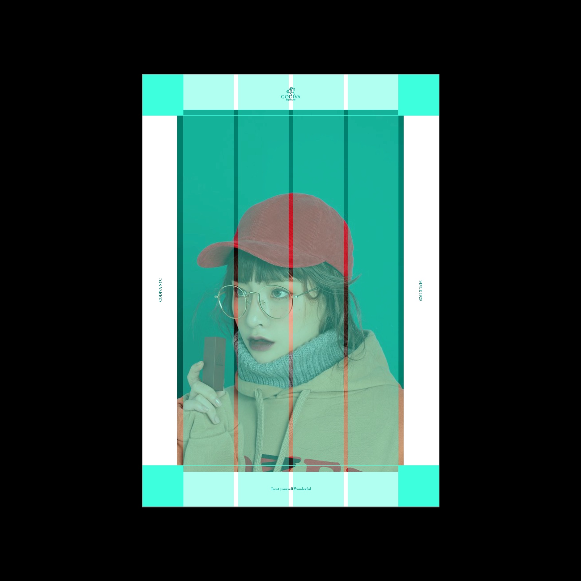
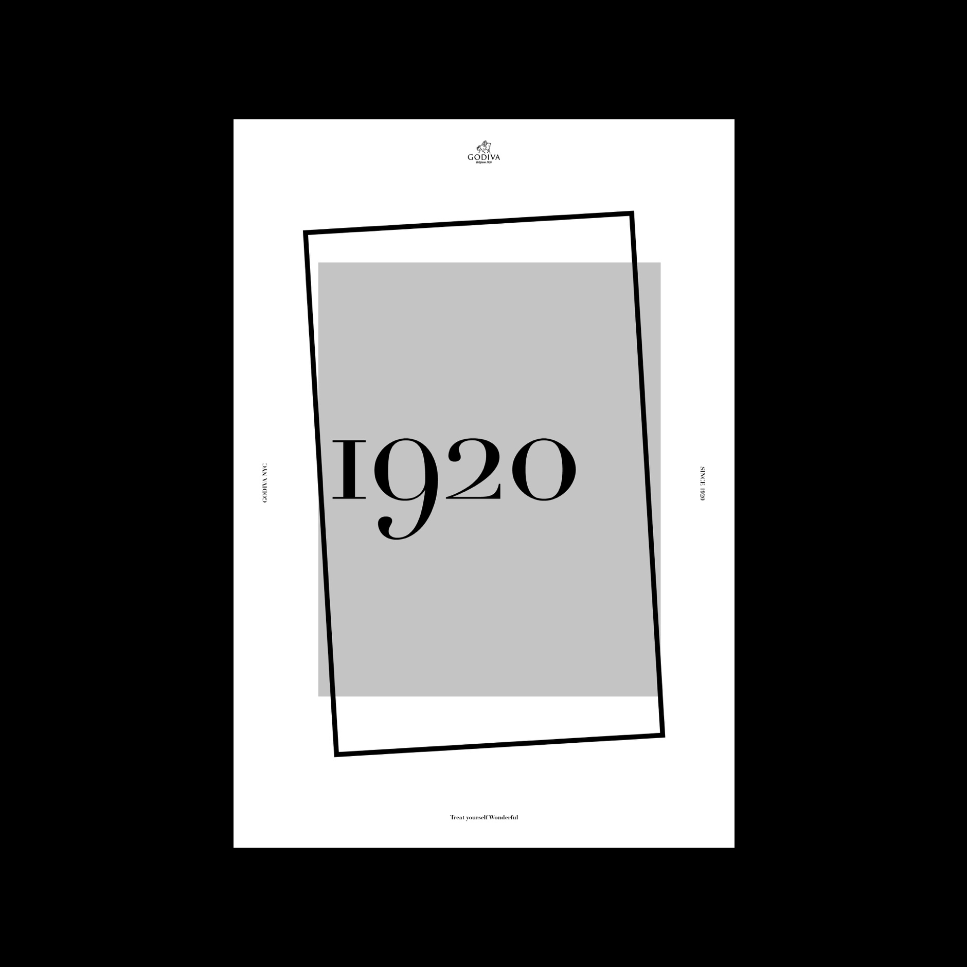
The brand behavior is 'discovery' mirroring the packaging experience of opening a chocolate box. Packaging and chocolate boxes are full of meaning and symbology from sharing, caring, to treating yourself. This behavior of unboxing informs the layout components with a simple framing. The interaction model for the interface was also based on this main brand behavior were users could unpack information and content throughout the site with simple, mobile-first, interactions.


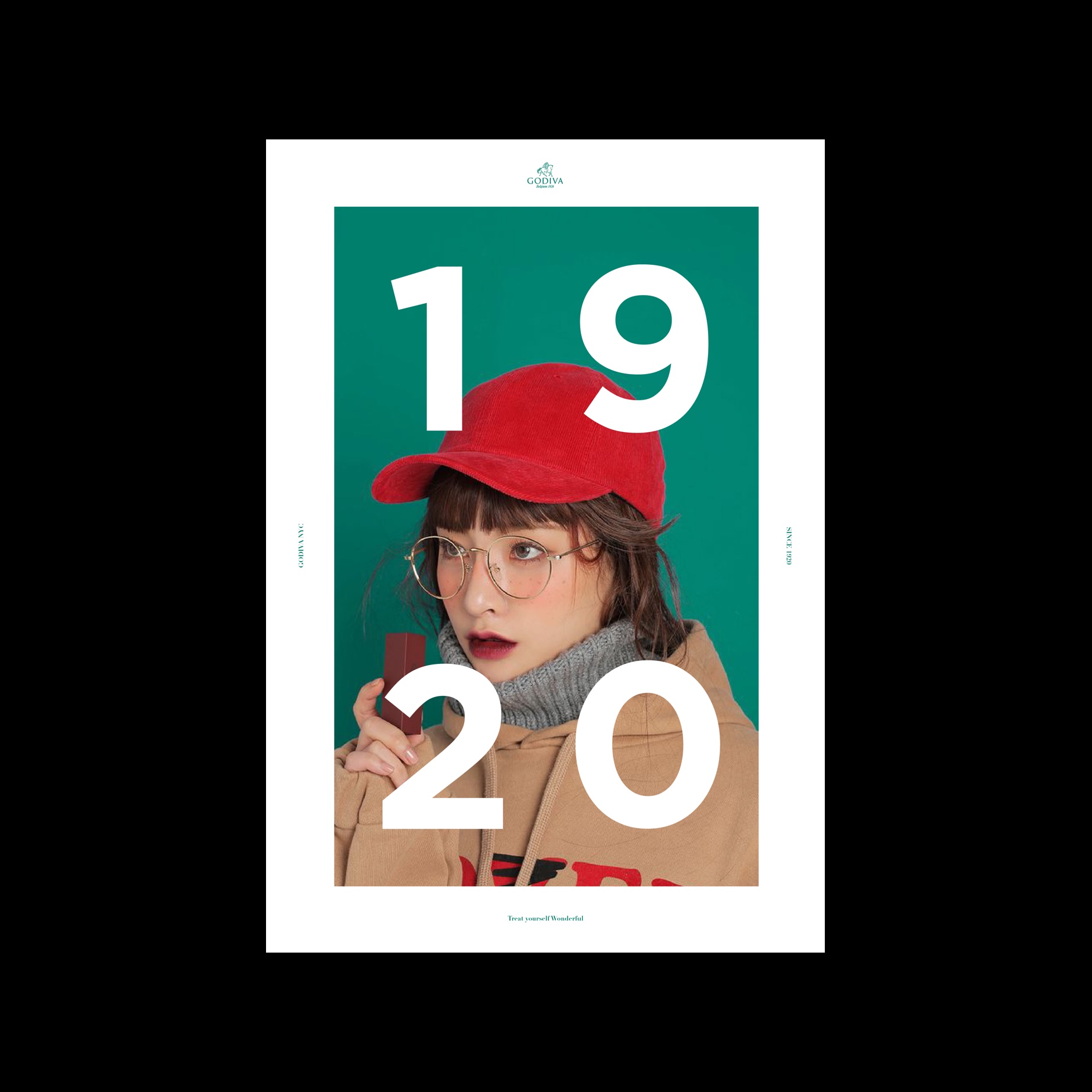
We unpacked few collections for each tier: white for the lowest entry price, black for premium, and gold for limited editions and VIP. The craft that Pierre Draps put into each of the chocolates he created became a legacy the following chocolatiers carefully respected and kept in their practice. For this reason, each chocolate credits and expands the story of the chocolate itself and the chocolatier that created it.


P
Process ↴


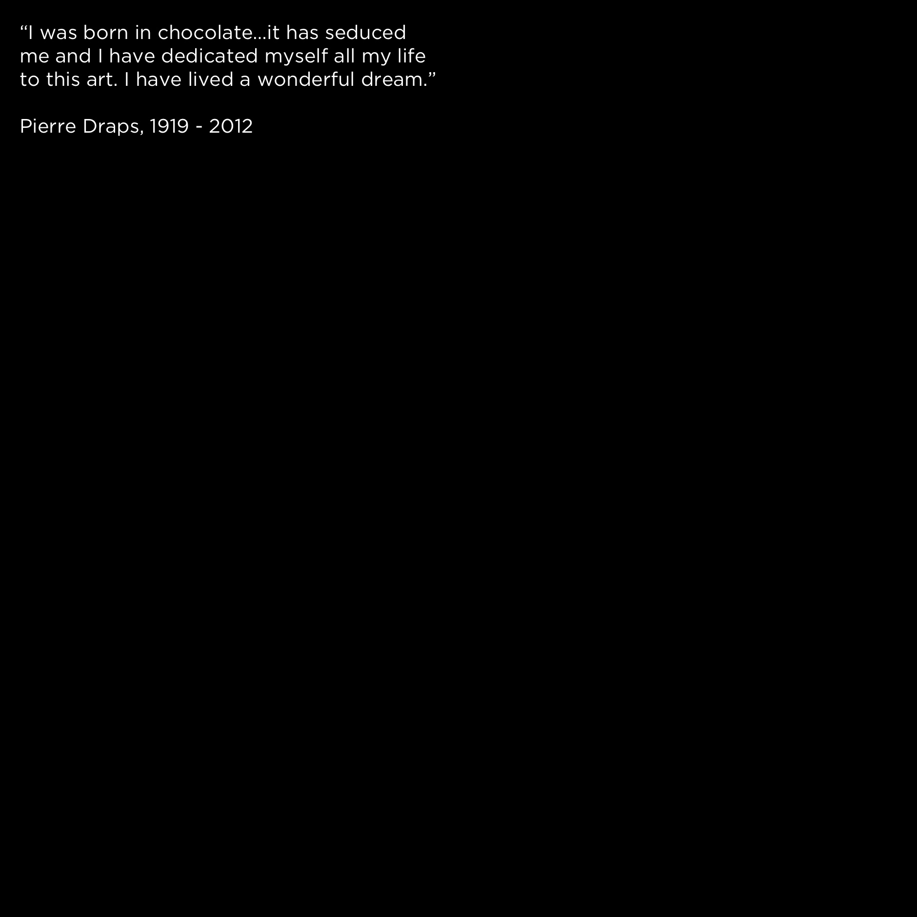
My last project at R/GA was to pitch (in addition to the campaign brief) the brand design and strategy for Godiva. The brief had two components. The first one was to pitch the global communication platform, lead by the campaign team, and the second one was brand design, as a proactive addition from R/GA. Godiva was founded in Brussels by Pierre Draps in 1926 and is one of the oldest and most iconic (and premium) chocolate companies in the world.
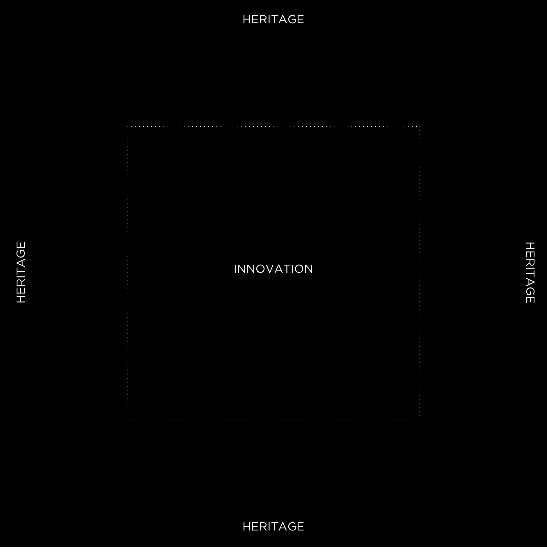
We were asked to create the brand design system in less than two weeks that could inform all the pieces that the campaign team would develop. As a first step, though, we had to look at the brand architecture and map out all the offerings they had. From there, we created a simple system that would allow the brand to keep the heritage from an entire century and the beautiful brand story but creating, at the same time, a framework that could start conversations in culture and show the innovative and modern creations of their current chocolatiers.
We were asked to create the brand design system in less than two weeks that could inform all the pieces that the campaign team would develop. As a first step, though, we had to look at the brand architecture and map out all the offerings they had. From there, we created a simple system that would allow the brand to keep the heritage from an entire century and the beautiful brand story but creating, at the same time, a framework that could start conversations in culture and show the innovative and modern creations of their current chocolatiers.
The brand behavior is 'discovery' mirroring the packaging experience of opening a chocolate box. Packaging and chocolate boxes are full of meaning and symbology from sharing, caring, to treat yourself. This behavior of unboxing informs the layout components with a simple framing. The interaction model for the interface was also based on this main brand behavior were users could unpack information and content throughout the site with simple, mobile-first, interactions.
From here, we unpacked few collections for each tier: white for the lowest entry price, black for premium, and gold for limited editions and VIP. The craft that Pierre Draps put into each of the chocolates he created became a legacy the following chocolatiers carefully respected and kept in their practice. For this reason, each chocolate credits and expands the story of the chocolate itself and the chocolatier that created it.
From here, we unpacked few collections for each tier: white for the lowest entry price, black for premium, and gold for limited editions and VIP. The craft that Pierre Draps put into each of the chocolates he created became a legacy the following chocolatiers carefully respected and kept in their practice. For this reason, each chocolate credits and expands the story of the chocolate itself and the chocolatier that created it.
R/GA ↴
London, 2018
Team ↴
Ned Karlovich (Group Creative Director, Brand Development)
Claire Townhill (Strategy Director)
Cris Mascort (Design Director)
Mark Fairbanks (Creative Director, Campaign)
James Temple (CCO)
Sarah Lent (Executive Director of Growth)
London, 2018
Team ↴
Ned Karlovich (Group Creative Director, Brand Development)
Claire Townhill (Strategy Director)
Cris Mascort (Design Director)
Mark Fairbanks (Creative Director, Campaign)
James Temple (CCO)
Sarah Lent (Executive Director of Growth)