09
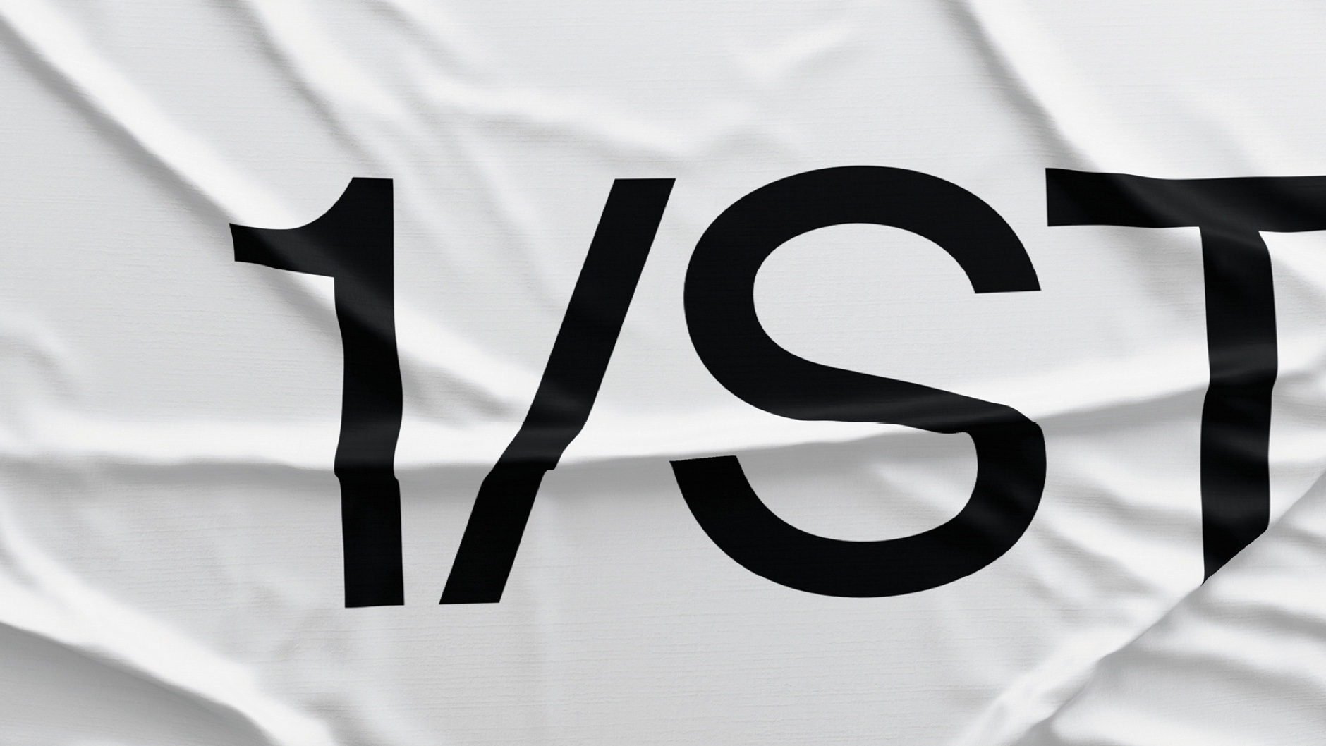
1/ST
Role ↴
Design Director
Role ↴
Design Director
Brand Identity
Art Direction
Editorial Design
Environmental Design
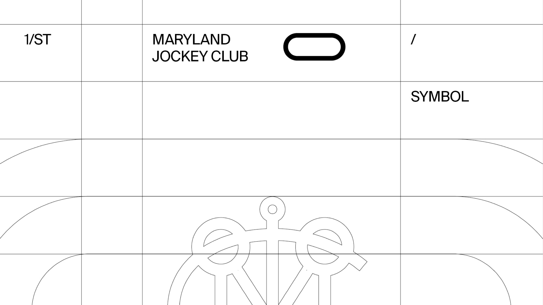
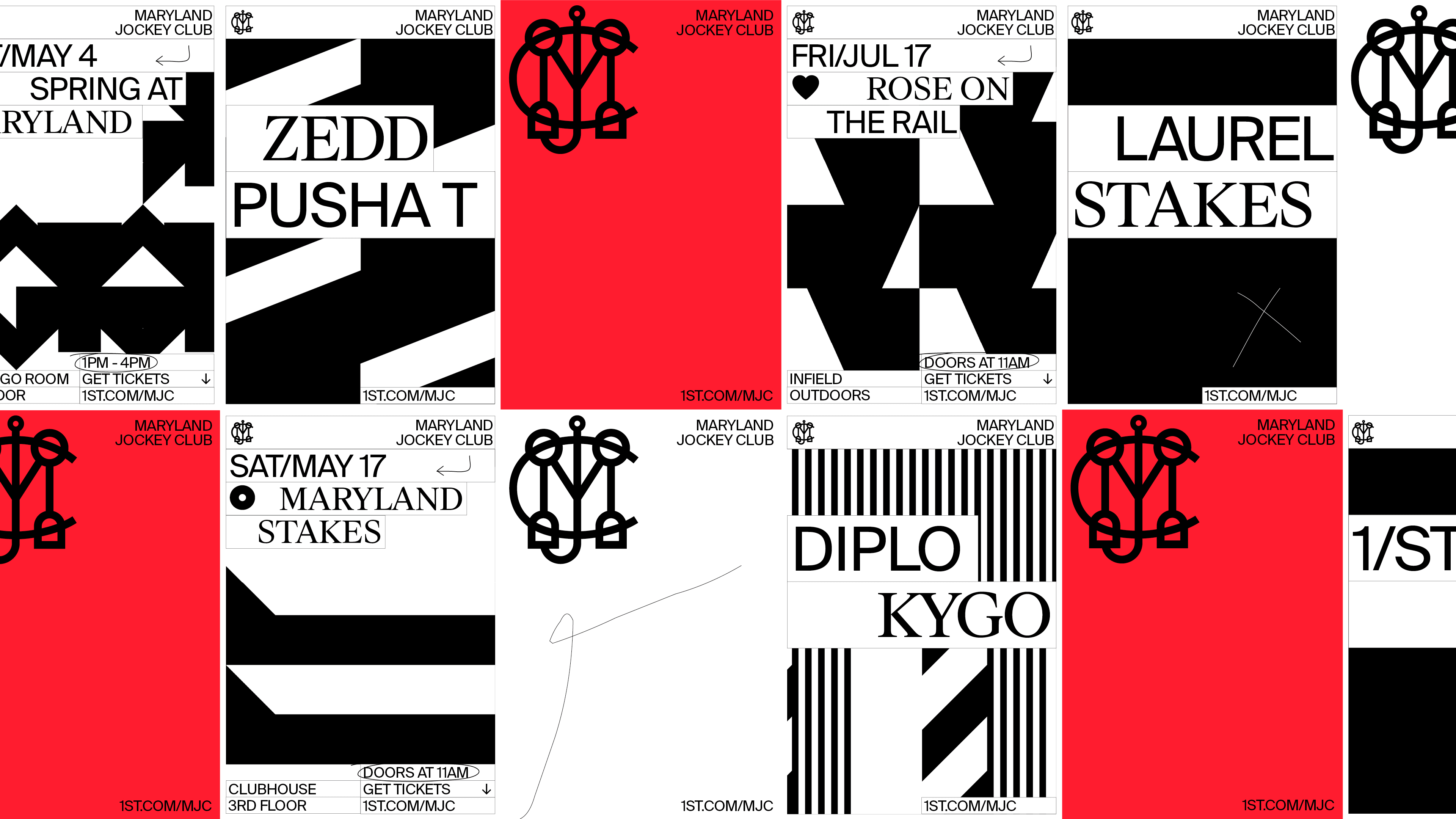
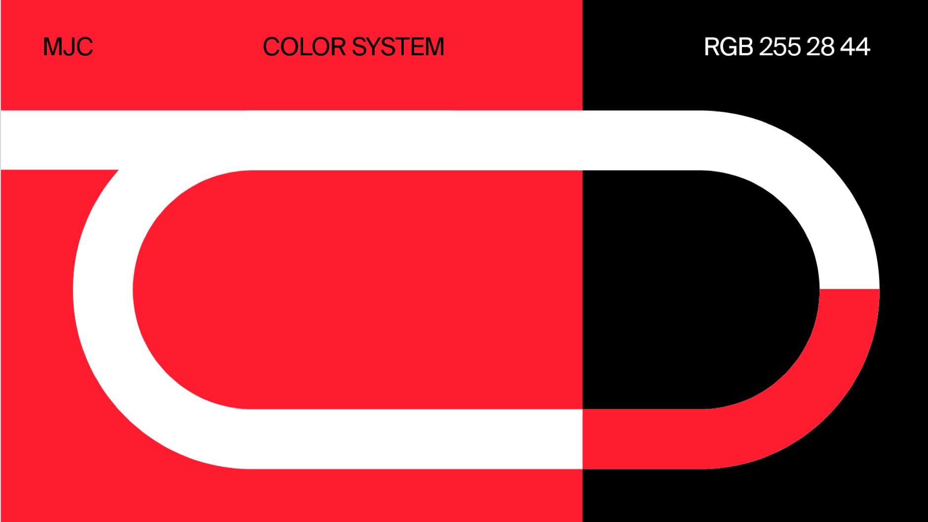
Brand Guidelines, Brand Identity and application system of all the venues of 1/ST (Stronach Group):
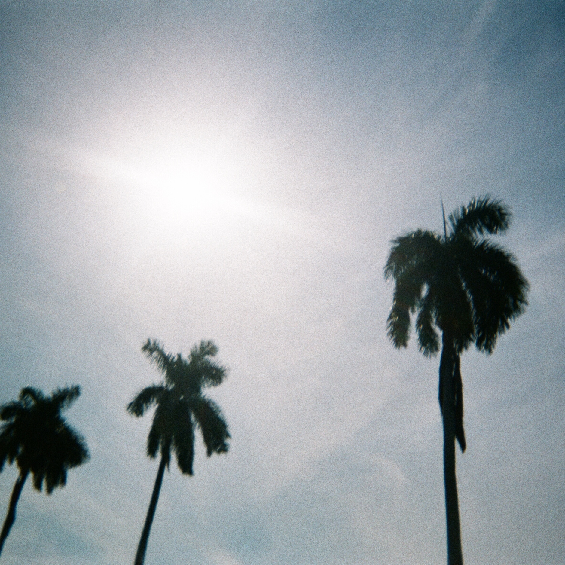
Gulfstream Park, FL
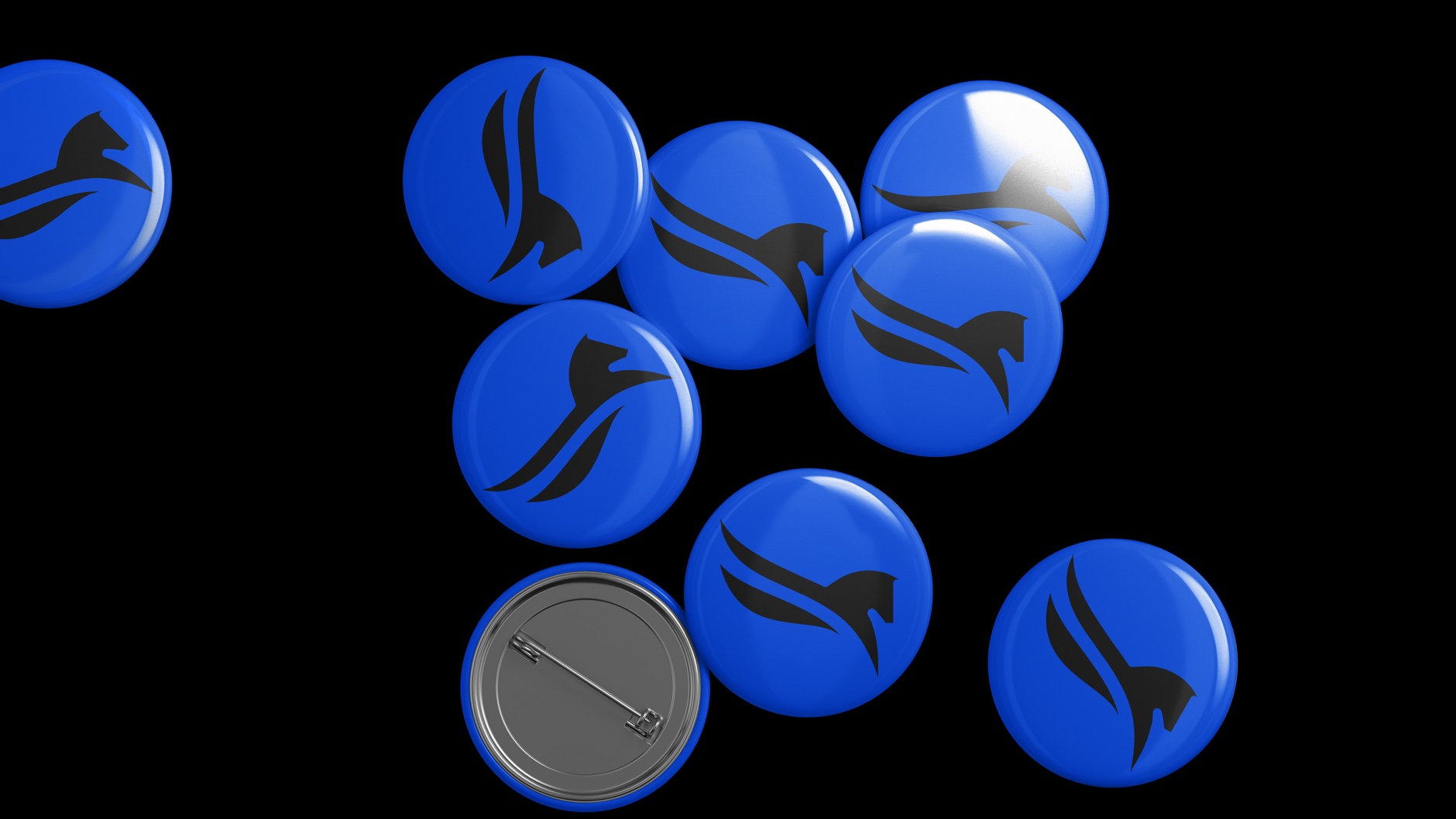
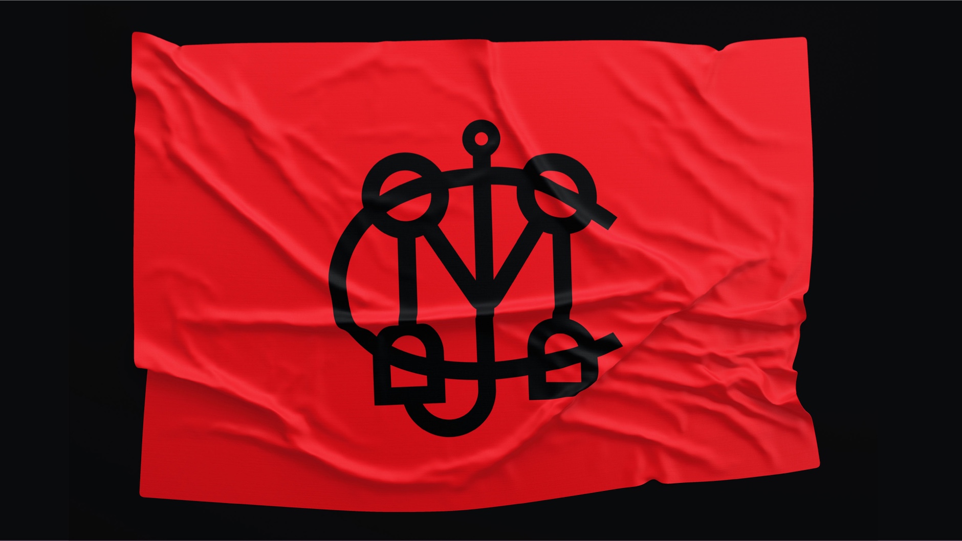
Maryland Jockey Club, MA
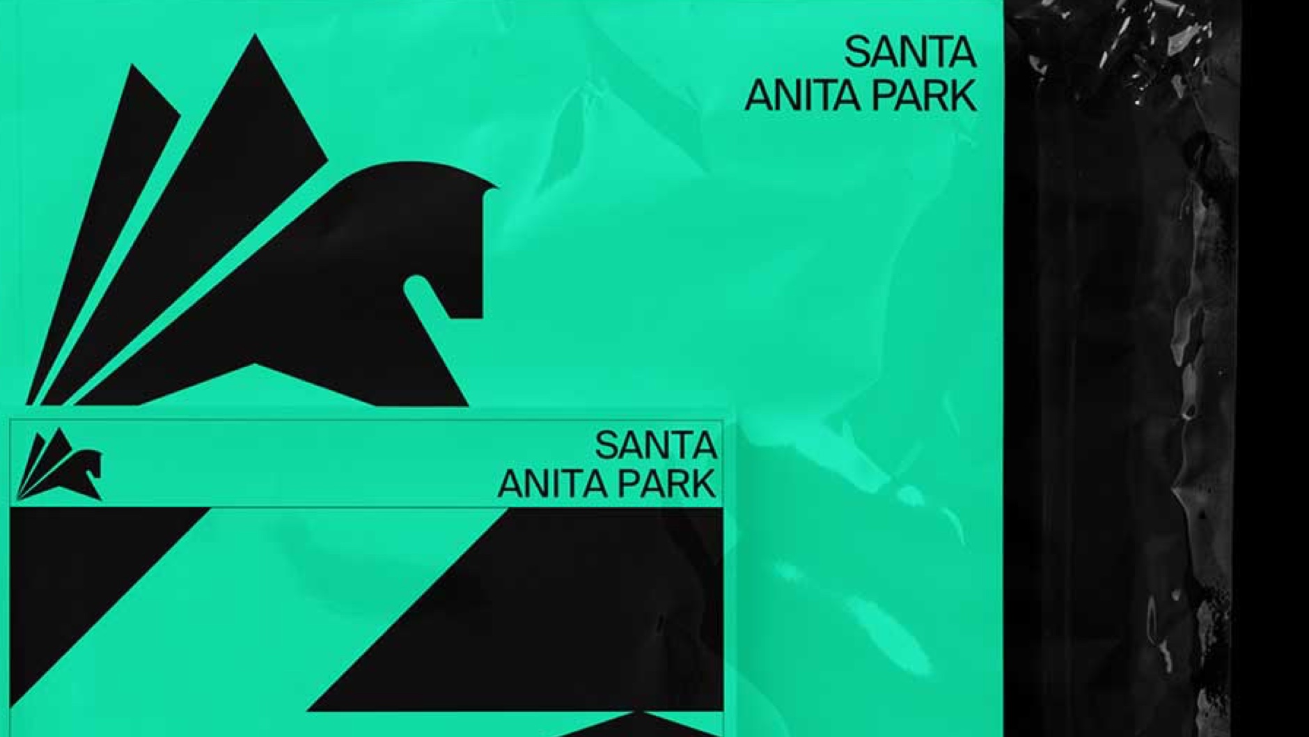
Santa Anita Park, CA
Golden Gate Fields, CA
Art Direction
Editorial Design
Environmental Design
Brand Guidelines, Brand Identity and application system of all the venues of 1/ST (Stronach Group):
Gulfstream Park, FL
Maryland Jockey Club, MA
Santa Anita Park, CA
Golden Gate Fields, CA


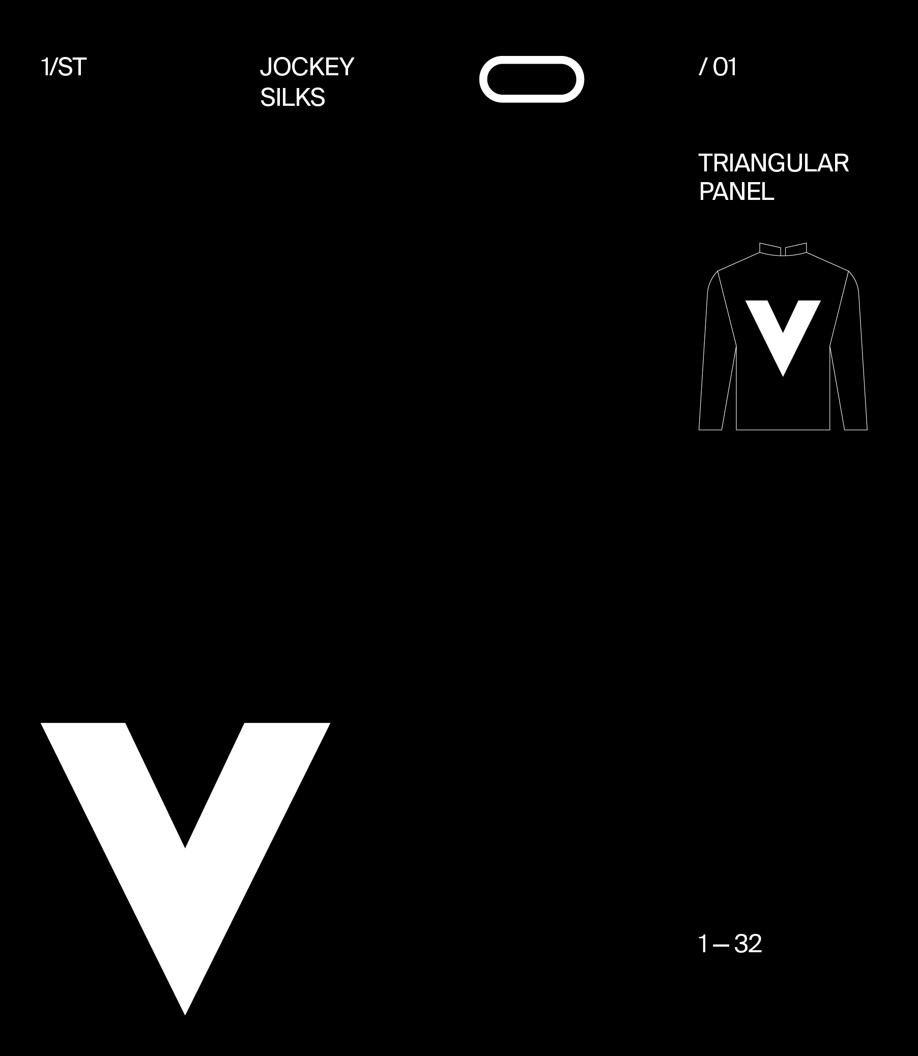
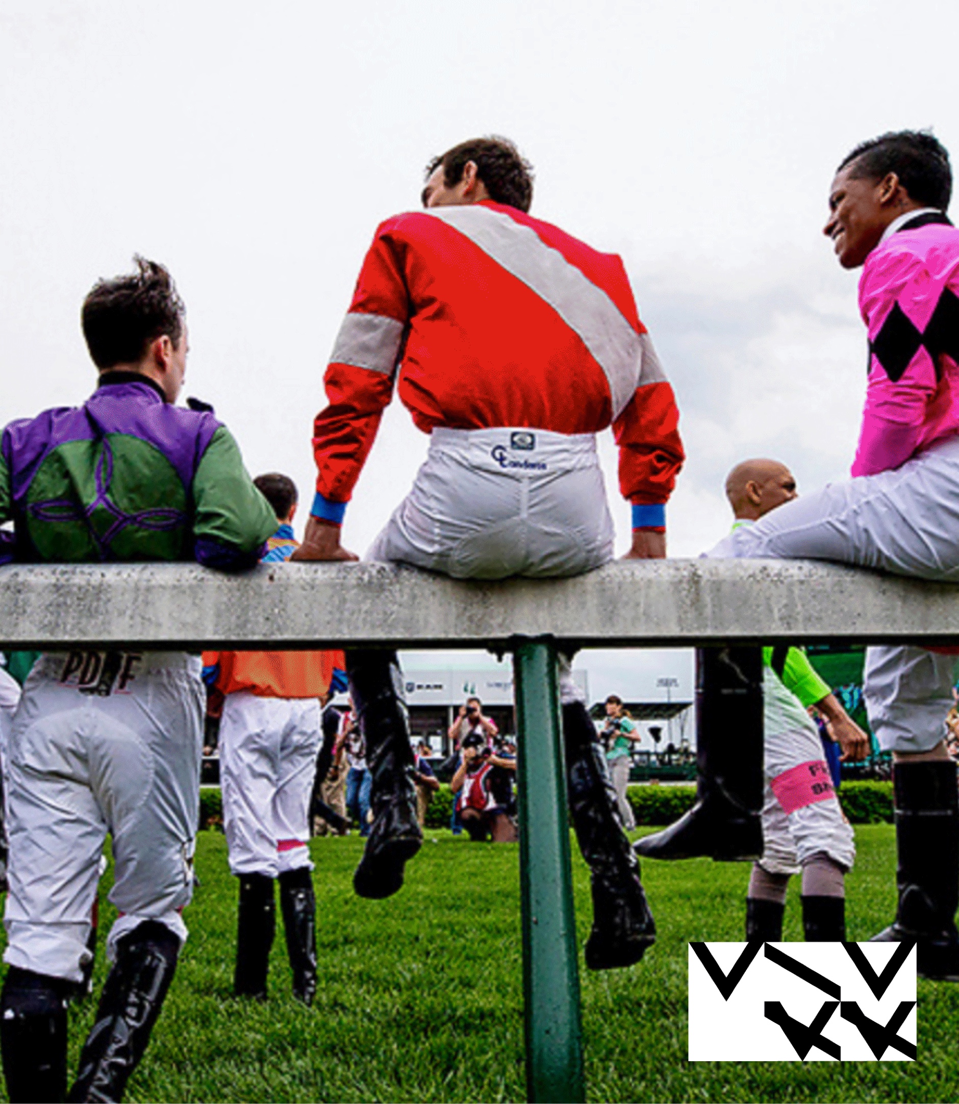
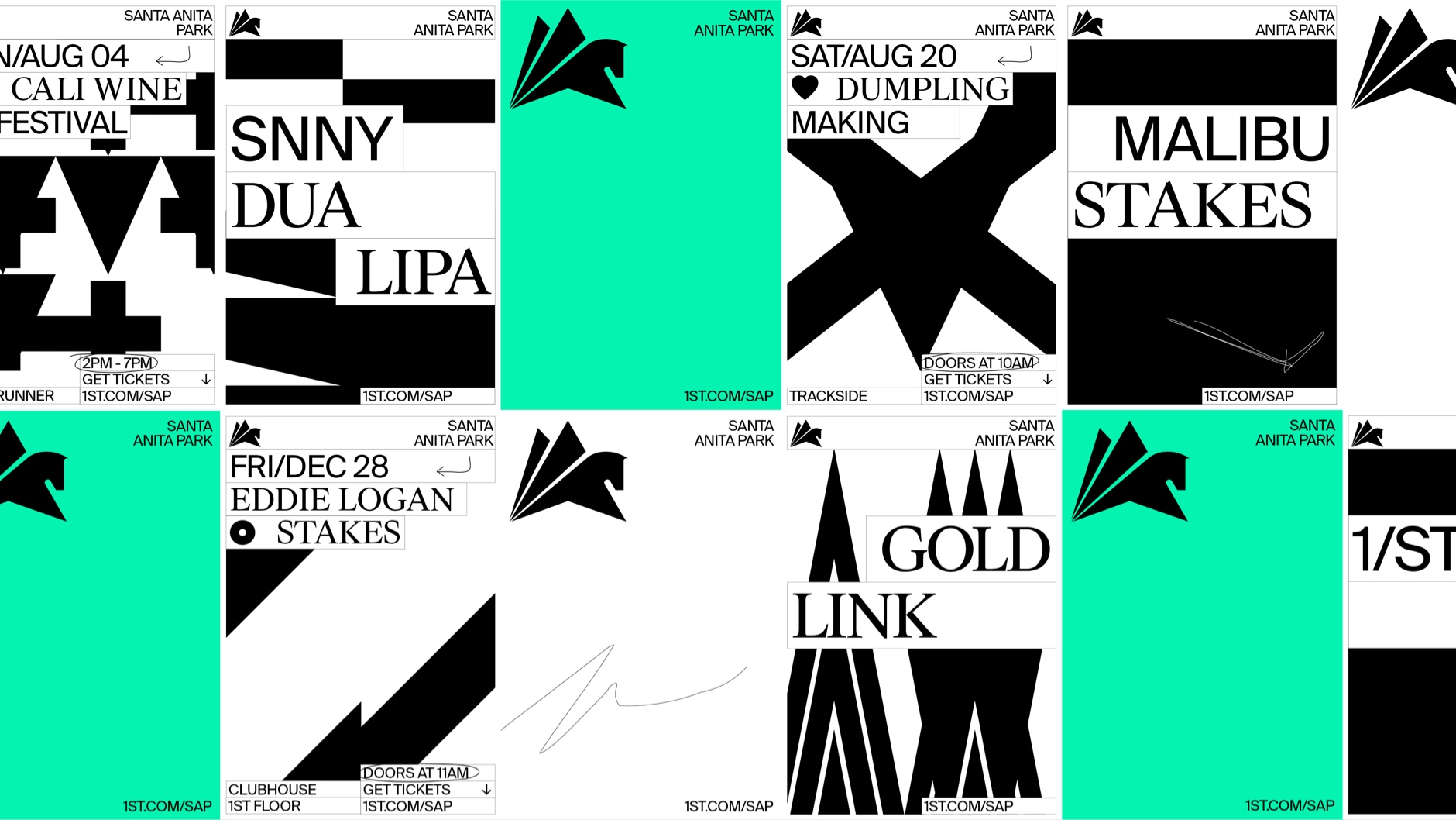
The language embedded in the sport, like the scribbles from betting books or the patterns from the jockey’s silks, belong to a secondary layer of brand expressions. Embraced the many idiosyncrasies of the track and built something cohesive with the many patterns and pieces.
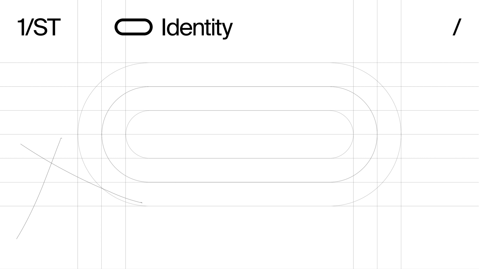
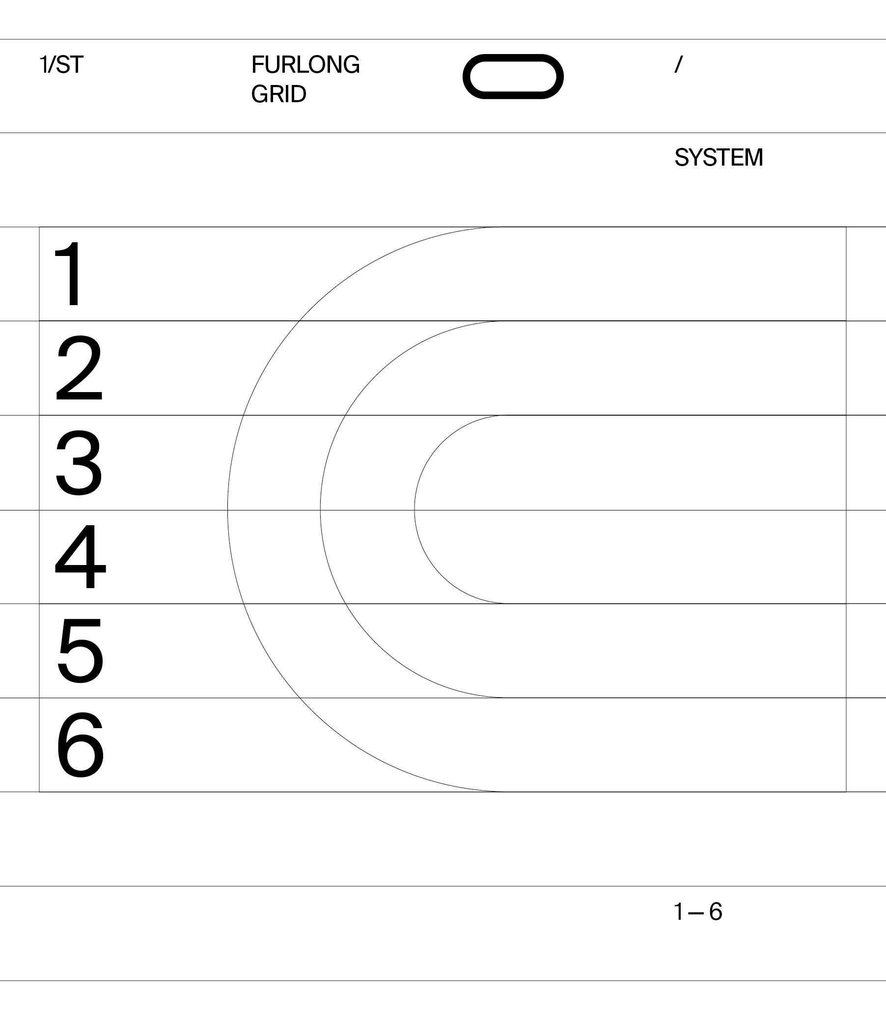
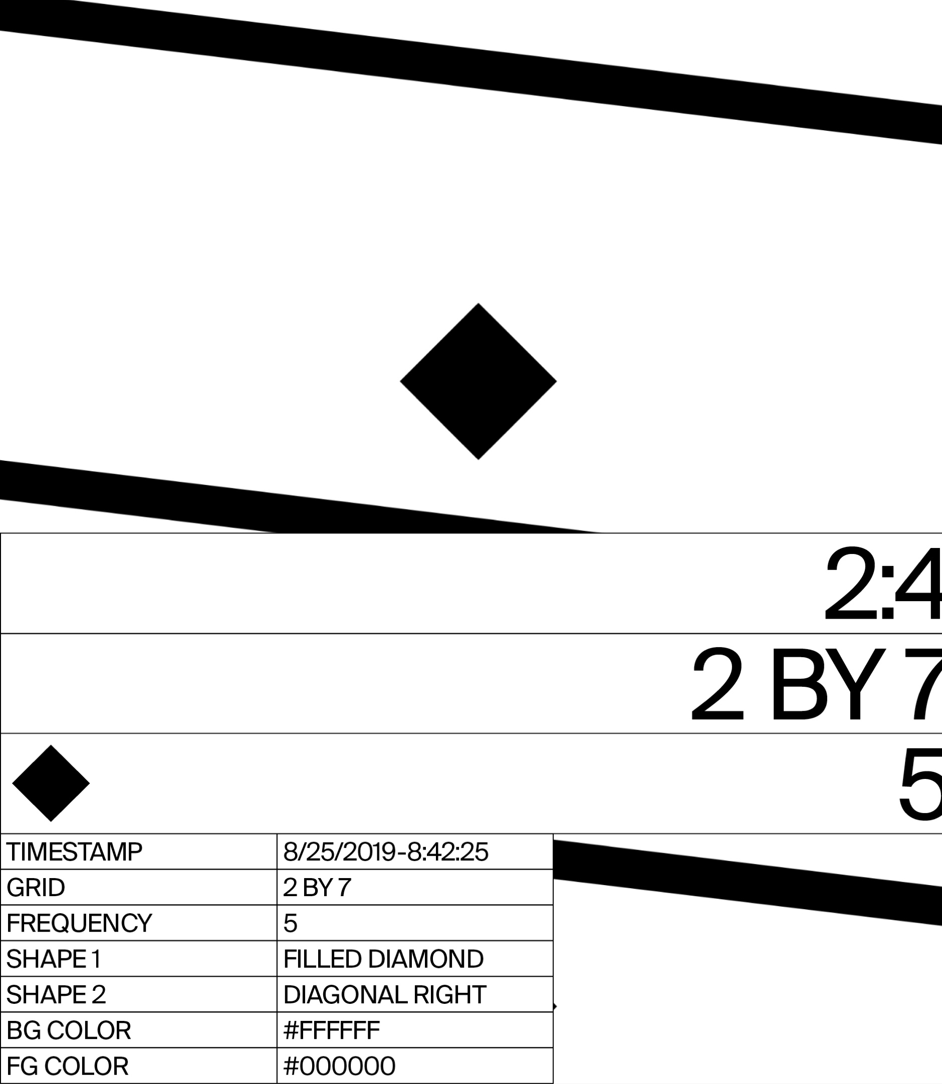
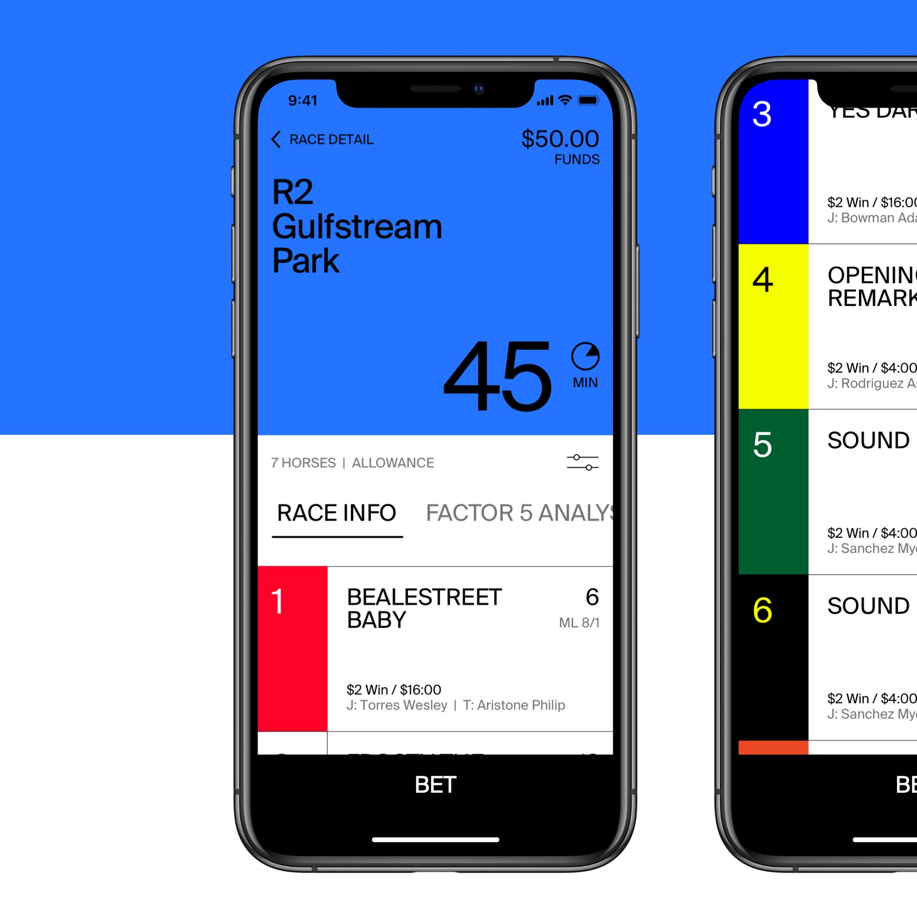
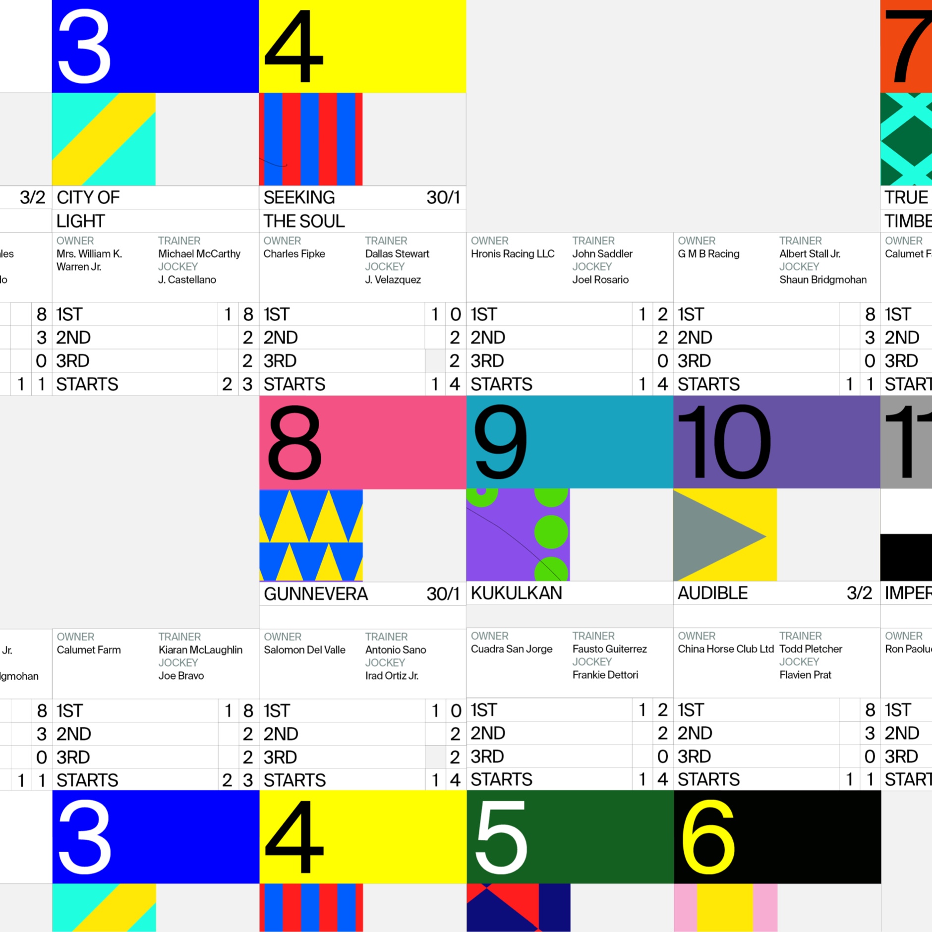
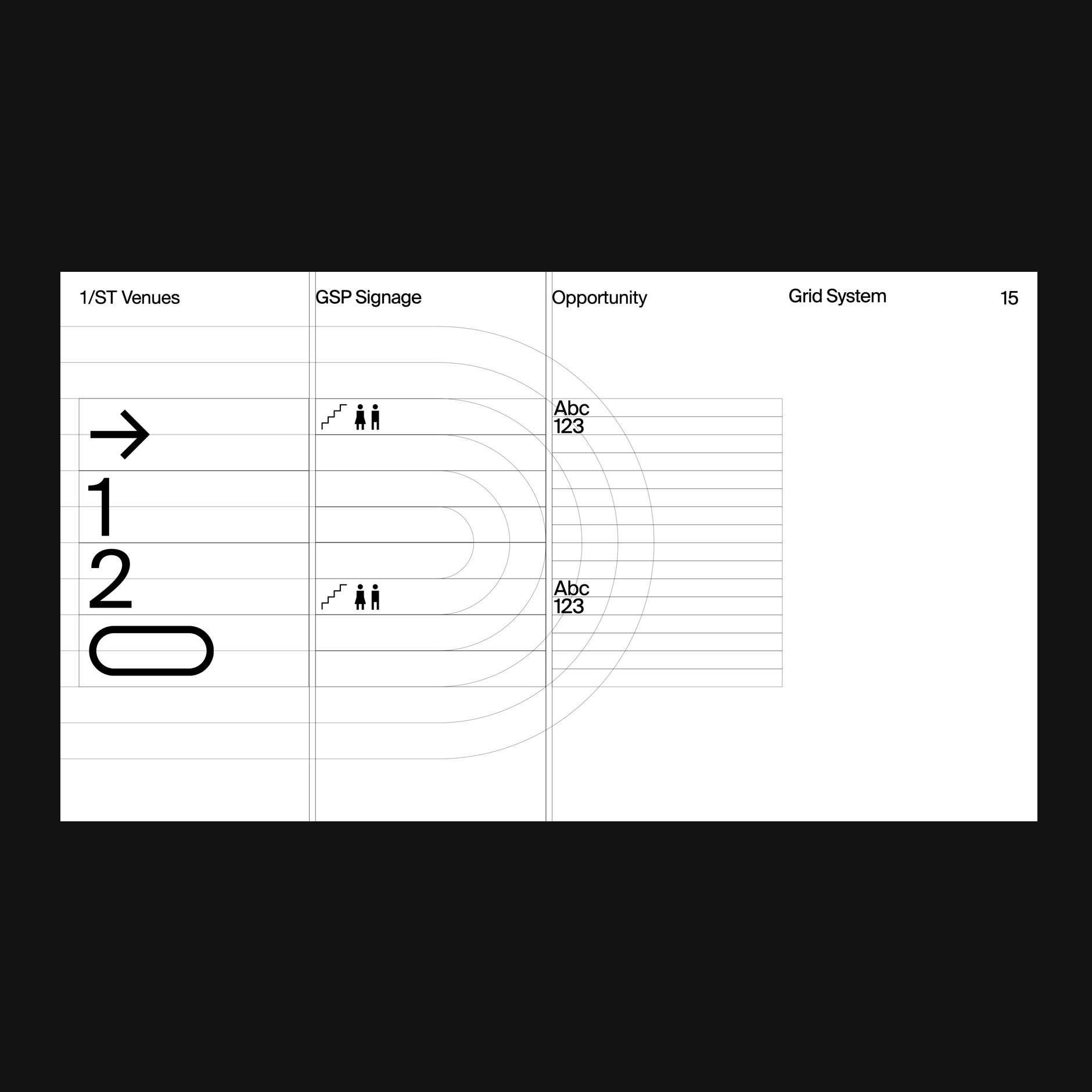
The furlong grid is the framework and foundation were the entire brand system sits. A furlong is a measure of distance in imperial units and U.S. customary units equal to one-eighth of a mile, equivalent to 660 feet, 220 yards, 40 rods, 10 chains (or approximately 201 meters). Today, furlongs are used to mark distances in horse racing. On a secondary level, we used jockey silks patterns to create a library of visual assets to create contextual communications. We also developed a tool to generate multiple combinations of colors and shapes to allow internal teams to produce more effectively those assets.


1/ST Venues ↴
The complexity of each venue also resides in the type of activities and content they regularly produce: from small to international races, concerts, workshops, restaurants, casinos to how they also operate internally from a production standpoint. Understanding all these intricate systems took us to set a series of on-boarding sessions to teach the internal teams on how to implement this new and complex brand language.
From the ethical constrains that came up from this controversial industry, we tried to help our client to build a more transparent brand that could feel confident enough to explain the challenges they are going through but also accommodate this variety of content and activities they do.


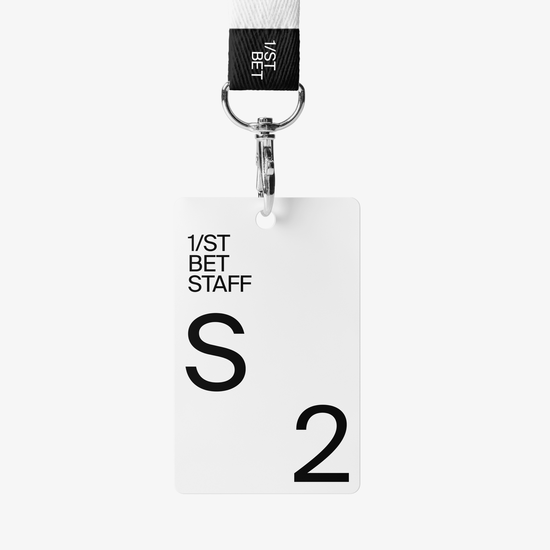
1/ST Bet identity + UI language ↴


P
Process ↴


I left London to join Virgilio Santos and Manuel Dilone’s new gig: the opening of Character New York’s office. While dealing with my visa process and freshly landed in the U.S., the team pitched and started rebranding the largest horse racing brand in the U.S. and Canada: The Stronach Group. Probably the biggest brand project I’ve ever been part of and the one that changed me as a designer. While having the chance to grow exponentially, I also had my ethics often challenged.
The whole rebranding took about a year and a half. We worked on thousands of versions, prototypes, events we also rebranded, races we watched, and few guideline versions. We developed and documented the system applied for all and each of the venues of the group, which is the most intrinsic and complex real-life implementation of the 1/ST brand system.
We designed from logotype for each of the venues and races to the identity system, signage, marketing, web banners, social media, newsletters, restaurant menus, among other executions. It required a lot of cultural and design research around understanding, not only the specific needs for each venue but the culture within each state and city, a series of multipurpose venues in the middle of a big sports crisis.
The complexity of each venue also resides in the type of activities and content they regularly produce: from small to international races, concerts, workshops, restaurants, casinos to how they also operate internally from a production standpoint. Understanding all these intricate systems took us to set a series of on-boarding sessions to teach the internal teams on how to implement this new and complex brand language.
From the ethical constrains that came up from this controversial industry, we tried to help our client to build a more transparent brand that could feel confident enough to explain the challenges they are going through but also accommodate this variety of content and activities they do.
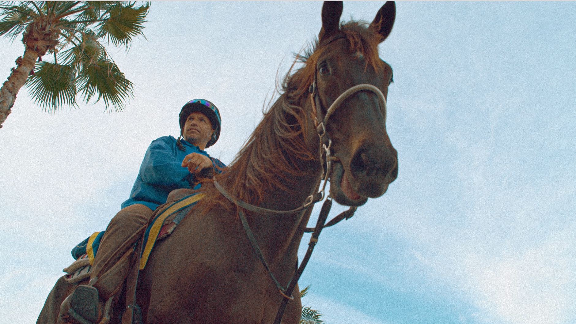
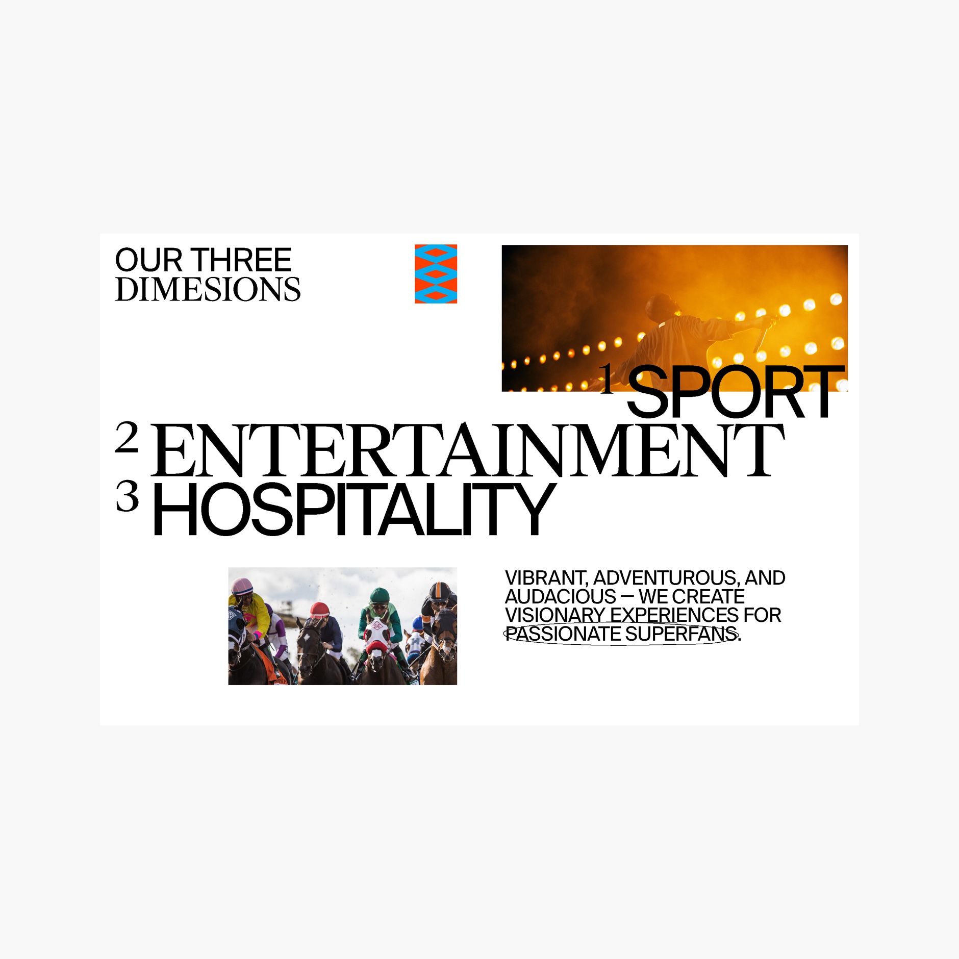
Until today, horse racing put the focus and the money on the business side and the betting. This time, as designers, we had the chance to reverse that focus: The brand system serves as a framework and steps back to let the culture and the horses be the center of it.
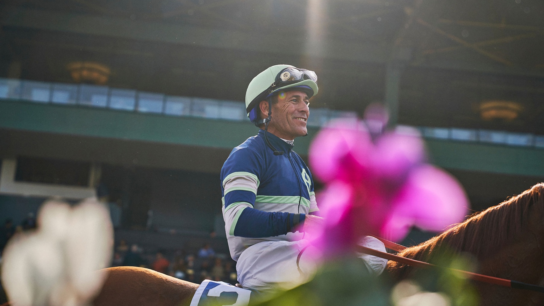
For example, the art direction never shows whips (at the same time, 1/ST was forbidding the usage of them in their venues). Every single image is curated to show horses with respect and honoring the beauty of one of the most powerful creatures on Earth. To select an ongoing brand photographer, we went through extensive research to find one that not only loves the sport but also has the sensibility to deliver on that promise.
The language embedded in the sport, like the scribbles from betting books or the patterns from the jockey’s silks, belong to a secondary layer of brand expressions. Embraced the many idiosyncrasies of the track and built something cohesive with the many patterns and pieces.
The furlong grid is the framework and foundation were the entire brand system sits. A furlong is a measure of distance in imperial units and U.S. customary units equal to one-eighth of a mile, equivalent to 660 feet, 220 yards, 40 rods, 10 chains (or approximately 201 meters). Today, furlongs are used to mark distances in horse racing. On a secondary level, we used jockey silks patterns to create a library of visual assets to create contextual communications. We also developed a tool to generate multiple combinations of colors and shapes to allow internal teams to produce more effectively those assets.
From this project, we also created a new brand initiative: Horses 1/ST. A new institution within the group that would invest, educate, and communicate transparency and ethics.
Character NY ↴
New York, 2018—19
Team ↴
Virgilio Santos (Creative Director)
Manuel Dilone (Creative Director)
Cris Mascort (Design Director)
Jon Marsh (Sr Designer)
Shu Shiao (Designer)
Jun Ki Hong (Designer)
Teri Kaplan (Project Manager)
Johnny Lee (Motion - Case Study)
Foundry ↴
Suisse Typefaces for Suisse International